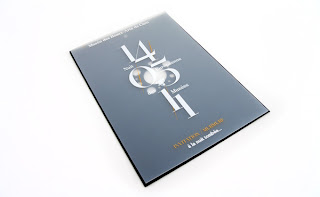
I really like the use of tracing paper within the publication because it's like the protective paper used in expensive photo albums.
I liked the minimal colour and design as well as the layout of the photography on this publication.
Information and way finding is key in exhibitions and I could consider how this could be adapted to reflect the exhibition content.
This has interesting layout of photography and type in a web form. A web based element could be considered for a deliverable in response to the brief.
I like the use of focus corners in this logo and the precise grid of its layout.
This a much more modern approach to film packaging. The use of cmyk dots on the brown stock works really well and is very visual.
This shows the range of products for an exhibition and how they can be united in design and colour scheme without just placing the same logo on everything.
I like the clean and simple layout of this photography and type, especially the amount of white space.
Using the space of the exhibition to display information and communicate the concept would be interesting for the brief.
The use of different stocks in this collection of design is interesting. It wraps the photographs as if precious and fragile.
The exhibition space will have many different areas which could be designed such as the cafe space and toilets.
I liked the editing and cropping of the photography in this publication.
Again the translucent paper showing through behind it. The closer the object is behind the more clear it is almost like the focus of a camera.
I like how the different parts of information are gathered together in this publication by using slits in the paper.
I like the format of this publication, how a different colour paper is used to cover the publication and has a fold out at the back with a breakdown of the information.
These are various examples of space and way-finding that have been designed for an exhibition. This could be a different area of graphics I could utilise on this project as exhibitions are all about the space being used.


No comments:
Post a Comment