My initial idea came from the session with Jo where i had whittled my interesting 10 down to a quote
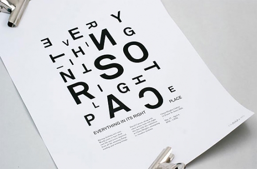
"Simplicity is about subtracting the obvious and adding the meaningful" which i found in a manifesto online. Visually i immediately saw this in paper craft with the negative and positive space you can create with paper. This led me to research into this topic where i sourced a variety of artists with outstanding craft and ideas.
When we had the small group crits with Jo it was brought to light that i didn't have a theory for my idea yet and it would take deep research to find something. I considered doing a publication on paper craft and the activities everyone can do to create with instructions. I started by researching into the quote itself and it turned out it was by a graphic designer/computer scientist called John Maeda who had written a short book on this quote which was accompanied by a set of 9 rules; reduce, organise, time, learn, differences, emotion, trust and failure.
The information i found was all based on web design however i saw the connection between these rules and graphic design. I thought about the rules and what parts of graphics could be applied to each part:
REDUCE: reduction in design - simplify/ don't cram all ideas into one
logo design development - reduction in the design - simplify - recognise
ORAGANISE: infographics
categorise research
thoughts - process
TIME: meet deadlines
plan time - domestic/work/social
process
DIFFERENCES: practice
process
design styles
type
LEARN: mistakes
knowledge in research
theory makes design
EMOTION: colour
audience
type
TRUST: instinct
FAILURE: make mistakes
learn from them
I thought this could possibly go into a publication for graphic designers to follow with simple rules to follow.
I also looked at simplistic design by Jason Munn and Olly Moss who i'm a fan of and found out through a workshop with Jo. I thought the way they designed could be a style to follow for this publication. I also thought i could do a publication on simplistic designs with underlying meanings as a spin on the quote.
Then i researched into the lost principles of design as i started looking into the rules of simple design. From this i also found design for the sexes and what men and women as and audience want.
I started looking at inspirational quotes for designers and there were many that i liked. When i was researching this i found some really nice designs of quotes and 7 quotes on design by Steve Jobs and a site on typographically designed quotes i had already seen on previous lists.
This is when i thought about doing a publication on inspirational quotes for designers through typography based on what i learnt from the 'History of Type' lecture we had from Richard as he spoke about visual language and understanding. I researched into meaning of type and how people read certain fonts and create an understanding from it. I want to apply this to the inspirational quotes and create a publication through typography.

Thursday, 29 March 2012


CoP: Theory into Practice - Typography Info
Fonts and their meanings
Much has been said about the need for a "sarcasm font". What does a font tell you about the tone of what's written in it, or the personality that chose it? Here's a pictorial guide.
Comic Sans:

Old English:

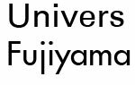
Copperplate: (note - copperplate is the font on my personal card.)

Courier:

Harlow Solid Italic:

Papyrus: (my company used to have a safety poster about forklifts written in this font. really.)

Showcard Gothic:

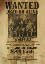
Stencil:

For example, you can easily see the difference in the character of the typefaces used in a Wild West "wanted" poster and those used for a traditional wedding invitation. Successful designing with type is all about making the most of those associations to make your visual point.

The typographic treatment sets the overall mood of a piece: clean, traditional choices for straight information delivery may suit a corporate report. On the other hand, more funky stylized fonts might work better for a poster promoting modern dance.
The huge range of typefaces available on the market is almost overwhelming. You can make a bit of sense of this by remembering the broad categories mentioned earlier. They are typically separated according to function, as many type foundries do as a matter of course.
When the letterform is flowing and curvaceous, the feeling conveyed is softer than the feeling communicated when the letterform is angular and hard-edged. A whimsical letterform will convey a lighthearted mood; one that is elegant will communicate sophistication.
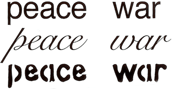
As another example, choose two words with contrasting or even opposite meanings, such as peace and war. After seeing each of these words in the various typefaces, which face do you think is most appropriate to the meaning of each word?
In information design clarity is essential, and it is telling that sans serif fonts, with their simple structures, are used for road signs. Sans serif is also ideal when type has to be a small size, as in some diagrams and maps.
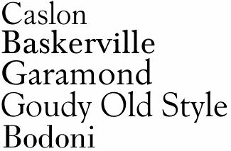
Which font you choose can be influenced by the subject matter; in such cases a knowledge of the origins of the font can help in coming to a decision. For example, Caslon and Baskerville are classical English, Garamond is French, Goudy is American, Bodoni is Italian, and so on.
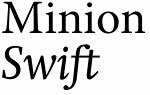
You do not have to rely on the classical fonts; contemporary serif fonts such as Minion and Swift are ideal for modern material.
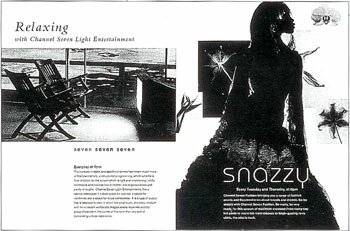
An effective mixture: below, a serif font for the word "Relaxing" and a contemporary sans serif for the word "snazzy" nicely reflects the shift in moods.
Budding designers need to develop a strong sense of how the different fonts create emotional, psychological, and historical resonances within
the reader.


Comic Sans:
Old English:
Copperplate: (note - copperplate is the font on my personal card.)
Courier:
Harlow Solid Italic:
Papyrus: (my company used to have a safety poster about forklifts written in this font. really.)

Showcard Gothic:
Stencil:

http://myfuturepast.blogspot.co.uk/2011/10/fonts-and-their-meanings.html
Choosing a Font
Letterforms are more than simply characters to be read. Additional information arises out of the associations that are attached to various styles of type.For example, you can easily see the difference in the character of the typefaces used in a Wild West "wanted" poster and those used for a traditional wedding invitation. Successful designing with type is all about making the most of those associations to make your visual point.
Source: Graphic Design Foundation Course by Curtis Tappenden, Luke Jefford and Stells Farris
Finding Meaning
The first thing that you do when you receive copy (text) for a design job is to read it for sense. Whether it is a 20,000-word book or a single word logo, ask yourself "what does this actually mean?" If you can't answer this question yourself, how can you hope to convey the meaning successfully to others?The typographic treatment sets the overall mood of a piece: clean, traditional choices for straight information delivery may suit a corporate report. On the other hand, more funky stylized fonts might work better for a poster promoting modern dance.
The huge range of typefaces available on the market is almost overwhelming. You can make a bit of sense of this by remembering the broad categories mentioned earlier. They are typically separated according to function, as many type foundries do as a matter of course.
Source: Graphic Design Foundation Course by Curtis Tappenden, Luke Jefford and Stells Farris
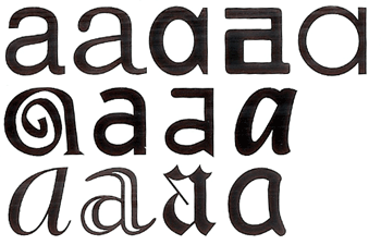
Creating a Mood
Let's look first at a single character of type to understand the power type can give your design. When set in various faces, even a single letter - such as a lowercase a - can evoke different feelings, depending on the design of the typeface.When the letterform is flowing and curvaceous, the feeling conveyed is softer than the feeling communicated when the letterform is angular and hard-edged. A whimsical letterform will convey a lighthearted mood; one that is elegant will communicate sophistication.
As another example, choose two words with contrasting or even opposite meanings, such as peace and war. After seeing each of these words in the various typefaces, which face do you think is most appropriate to the meaning of each word?
Source: Design Basics for Creative Results by Bryan L. Peterson
Further Understanding Mood and Meaning
The content of the material and the purpose of the design are the main factors in deciding your choice of font.In information design clarity is essential, and it is telling that sans serif fonts, with their simple structures, are used for road signs. Sans serif is also ideal when type has to be a small size, as in some diagrams and maps.
Which font you choose can be influenced by the subject matter; in such cases a knowledge of the origins of the font can help in coming to a decision. For example, Caslon and Baskerville are classical English, Garamond is French, Goudy is American, Bodoni is Italian, and so on.
You do not have to rely on the classical fonts; contemporary serif fonts such as Minion and Swift are ideal for modern material.
An effective mixture: below, a serif font for the word "Relaxing" and a contemporary sans serif for the word "snazzy" nicely reflects the shift in moods.
Budding designers need to develop a strong sense of how the different fonts create emotional, psychological, and historical resonances within
the reader.

Source: Graphic Design School by David Dabner
Quick Tips: What to Consider when Using Type
- What font will best communicate the feeling of your message? Does your font harmonize with or detract from your message?
- Will two or more different fonts be more effective in displaying the concept than one? Consider using a serif face with a sans serif face, for example.
- What type size will best convey the idea of the design? Is the size appropriate for the audience? Does it complement the other elements?
- Is the type properly placed in the format to have the most impact on the reader? Are the shapes of the body copy pleasing or are they unattractive?
- Is the font one that needs to hold up well over a period of time (a classic), or is a more current, trendy font a better choice?
Source: Design Basics for Creative Results by Bryan L. Peterson
http://www.nhsdesigns.com/graphic/typography/choosing-font.php
THE ART OF TYPOGRAPHY
The original meanings of the words 'Typeface' and 'Font' have become blurred through common usage . Both now tend to be used to describe the various styles of letterforms available to designers and printers.
TYPEFACES
The term 'Typeface' was originally used to identify the design elements in a letter style e.g. bold, underlined, or italic.
Bold Type can add an emphasis or strength to the style of a font.
Underlined Type is an effective way of emphasising the title of a document. It can also be used to call attention to an important section of text.
Italic Type can also emphasise an important word or passage of text, but it tends to be used in a more informal context. Italic fonts have an animated style and are often selected for designs where there is a need to convey the illusion of speed and energy.
FONTS
The term 'Font' was originally used to identify a family of typefaces. The fonts below are all members of the 'Futura' font family. Their height is measured in points - the standard unit for printed text. There are about 72 points to one inch.
Although the above fonts are all the same height, note how their breadth varies according to their style. Some fonts are more suited to fitting into a confined area of a design, while others like to spread themselves out.
There are two main font types:
Serifs are the extended corners at the ends of a letter and like all good design, they have evolved naturally. They originated in the stone-carved letters of the Ancient Romans. Stone masons discovered that it was technically easier to finish chiseling the ends of a letter in a slow curve. Not only did serifs look more elegant but they were also very practical as they formed a natural channel for water or rain to flow away as it cleaned dust from the corners.
Serif fonts are the most legible and are commonly used for large blocks of text. Their wide horizontal baseline emphasises the line of text for the eye and makes reading more comfortable.
Sans-serif fonts are simply fonts without serifs ('sans' means 'without' in French). They are also sometimes called gothic fonts.
Fonts are usually selected for either their legibility or their stylistic effect.
THE LEGIBILITY OF A FONT
Legibility is the measure of how quickly a font can be read. The balance between legibility and style is one of the important factors to be considered when choosing a font for a design.
Serif fonts like Times New Roman above are the easiest to read. They usually appeal more to an older target audience who are more concerned with content than style.
Novelty fonts like Carnivale are fun but are less legible and tend to date quickly. They tend to appeal more to a younger target audience who often prefer style over content.
Calligraphic or script fonts, especially in capitals, are often the most illegible.
The choice of colour can also have a strong effect on the legibility of a font.
THE STYLE OF A FONT
Fonts can speak in a voice that reflects the style or emotion of the words they make. The elements of shape and colour help to communicate their meaning.
Based on the carved letterforms on the buildings of Ancient Rome and used as the typeface of The Times newspaper today, the 'Times New Roman' font represents the voice of authority. This idea is reinforced here by its dark blue colour - the colour of law enforcement.
'Times New Roman' was designed in 1931 by British designers Stanley Morison and Victor Lardent. However, certain authorities now dispute this and believe it to be the work of the American designer, Starling Burgess.
Various elements contribute to the sense of disorder in the 'Bedrock' font above. The primitive shape of each letterform is chiseled to form a crooked design, while the irregular arrangement and different colours heighten the effect.
Designed in 1995, it was probably inspired by 'The Flinstones' who lived in Bedrock, and it reflects the anarchy of a cartoon world.
Anger is expressed in the aggressive and calculatingly crude calligraphy of the 'Chiller' font. Its dangerous aura is amplified by the symbolic use of red - the colour of rage.
'Chiller' was created by the British designer, Andrew Smith.
An ice cold blue colour, smooth rounded corners and a long relaxing shadow, all contribute to the feeling of calm in the 'VAG Rounded BT' font.
BT stands for Bitstream, the company from Cambridge MA, USA who designed the font.
'Ravie' has the energy and bouncy movement necessary for a fun-filled font. Bright primary colours enhance its cheerful form.
'Ravie' was designed by Ken O'Brien in 1993-94 at the Art Center in Pasadena, California.
The combination of italic type, graduated colour and blurred form creates the illusion of speed using the 'Slipstream LET' font.
Slipstream was designed by the Letraset Type Studio.
By their nature bold fonts shout. 'Futura XBlk (extra black) BT' is a no nonsense, sans-serif font that gets its message across loud and clear.
Paul Renner (1878-1956), a typographer associated with the Bauhaus in Germany designed the original Futura fonts. They were the most popular sans-serif fonts in the first half of the 20th century.
Certain fonts inherit a reputation for style through their association with a particular time or place. 'Broadway Engraved' evokes the Art Deco era which was one of the most popular design movements of the early twentieth century. A metallic gold finish completes the stylish look.
This font is based on 'Broadway' which was designed by Morris Fuller Benton between 1925-28.
The interaction between the abstract elements of positive shape and negative space is an important consideration in the design of good typography.
POSITIVE SHAPE - NEGATIVE SPACE
By positive shape we mean the shape of the letter itself.
By negative space we mean the background shapes between the letters.
Equally balanced positive shapes and negative space interlock to create a strong architectural quality in the Logan font.
If you look closely you will see that a little trickery has been used to manipulate the positive shapes and negative space of this Stencil font.
A careful balance between positive and negative elements was essential to create the rhythm and vitality of this script font. Script or calligraphic fonts, like Luftwaffe, should be avoided if you are looking for legibility.
Ravie is a fun font for those who place stylistic effect over legibility. Although it looks improvised and intuitive, there is a calculated balance between its positive shapes and negative spaces. This effect is made more visible by the circle which highlights its animated and abstract qualities.
The elephant is a beast of burden and the Elephant font reflects this quality. Like steel girders, its characters look to be able to support a great weight. The balance between the strength and delicacy of their positive and negative forms adds a sense of refinement to this typographic powerhouse.
The interaction between the positive and negative shapes of the Wide Latin font evokes the dynamic forms of Geometric Abstraction in mid 20th century painting.
http://www.artyfactory.com/graphic_design/typography/the_art_of_typography.htm
Subscribe to:
Comments (Atom)