Me and Emily looked at some imagery as we discussed our concept ideas and research.
D&G's simple packaging matches its very simply designed bottles. It outlines the white square design on the white box with embossing, this subtle finish adds more luxury to the simple design and creates a texture to the stock.
The opposite side features the model the scent is connected to using the ad campaign as part of its identity.
This is an example of black on black which we discussed in using for the packaging with subtle detail added avoiding garish colours and to much busyness.
Another example of black on black - looks very sophisticated and professional.
Unusual packaging design using tessellated shape of the triangle but remains freestanding.
The Golden Ratio is a beautifully simple piece of mathematical theory that can help make your designs feel well proportioned and pleasing on the eye. We explain how to use it.
There’s a common mathematical ratio found in nature that can be used to create pleasing, natural looking compositions in your design work. We call it the Golden Ratio, although it’s also known as the Golden Mean, The Golden Section, or the Greek letter Phi.
Based on the Fibonacci Sequence (which you may remember from either your school mathematics lessons or Dan Brown's novel The Da Vinci Code), the Golden Ratio describes the relationship between two proportions.
Fibonacci numbers, like many elements found in nature, follow a 1:1.61 ratio - this is what we refer to as the Golden Ratio, and as it forms such a common sight in nature, it feels pleasing to the eye when we use this same ratio in our design work.
The Golden Ratio is the relationship between two numbers on the Fibonacci Sequence... ... and plotting the relationships in scale provides us with a spiral that can be seen in nature all around us
It’s believed that the Golden Ratio has been in use for at least 4,000 years in human art and design, but it may be even longer than that - some people argue that the Ancient Egyptians used the principle to build the pyramids. In more contemporary times, the Golden Ratio can be observed in music, art, and design all around you.
Examples of use
Use of the Golden Ratio is well documented in art and design throughout history, and can be seen in everything from architecture to the grand masters. By applying a similar working methodology you can bring the same design sensibilities to your own work. Here are just a couple of examples to inspire you:
The Panthenon
Ancient Greek architecture used the Golden Ratio to determine pleasing dimensional relationships between the width of a building and its height, the size of the portico and even the position of the columns supporting the structure. The final result is a building that feels entirely in proportion. The neo-classical architecure movement reused these principles too.
The Last Supper
Leonardo da Vinci, like many other artists throughout the ages, made extensive use of the Golden Ratio to create pleasing compositions. In the last supper, the figures are arranged in the lower two thirds (the larger of the two parts of the Golden Ratio), and the position of Jesus is perfectly plotted by arranging golden rectangles across the canvas.
Examples in nature
The Golden Ratio can be seen in nature all around us, from seashells to flowers
There are numerous examples of the Golden Ratio in nature - you can observe the ratio all around you! Flowers, sea-shells, pineapples, and even honeycombs all exhibit the same principle ratio in their make-up. So using the Golden Ratio in your design work is both appropriate and foreshadowed in our everyday environment.
How to construct a Golden Ratio rectangle
Creating a Golden Rectangle is pretty straightforward, and starts with a basic square. Follow the steps below to create your own Golden Ratio:
Step 01: Draw a square.This will form the length of the 'short side' of the rectangle
Step 02: Divide your square in half with a vertical line, leaving you with two rectangles.
Step 03: In one rectangle, draw a line from one corner to the opposite corner.
Step 04: Rotate this line so that it appears horizontally adjacent to the first rectangle.
Step 05: Create a rectangle using the new horizontal line and original rectangle as guides.
Use the Golden Ratio in your design work
Using the Golden Ratio is simpler than you might think! There are a couple of quick tricks you can use to estimate it into your layouts, or you can plan a little more and fully embrace the concept!
The quick way
If you’ve ever come across the 'Rule of Thirds' you’ll be familiar with the idea that by dividing an area into equal thirds both vertically and horizontally, the intersection of the lines will provide a natural focal point for the shape.
Photographers are taught to position their key subject on one of these intersecting lines to achieve a pleasing composition, and the same principle can be used in your page layouts, web mockups, and poster designs.
Although the rule of thirds can be applied to any shape, if you apply it to a rectangle with proportions approximately 1:1.6, you get very close to a Golden Rectangle, which makes the composition all the more pleasing to the eye.
Full implementation
If you want to fully implement the Golden Ratio into your design, you can do so easily by ensuring that the relationship between your content area and sidebar (in a website design, for example) adheres to the 1:1.61 ratio.
It’s okay to round this up or down by a point or two to make the numbers worth with pixels or points - so if you have a content area of 640px, a sidebar of 400px will match the Golden Ratio well enough to work, even though it’s actually a ratio of 1:1.6.
Using the Golden Ratio in a web-page layout provides a natural, eye-pleasing result
Of course, you can also sub-divide the content and sidebar areas up using the same ratio, and the relationship between a webpage’s header, content area, footer and navigation can also be designed using the same basic Golden Ratio.
In truth, scientists aren’t sure what it is about the ratio that humans like so much. What they are sure about is how much we like it. Studies suggest that even minute changes to an image making it truer to the golden ratio have large impact on the brains of those looking.
Something deep in the core of our mind registers the golden ratio as beautiful, a fact artists and architects have utilized for thousands of years, knowingly or not. It is primal language in imagery. The result is organic, intuitive, and just feels right.
Divine Composition
How then do you use this magic number in the composition of your web page? The math may seem like a stifling box that your creativity will struggle in, but the golden ratio is simply a useful guideline. Having a basic guideline to build from can end up giving you more creative room by taking some of the guesswork out of proportions and placement.
Think of it as a tool instead of a cage. At its most basic, you can use the golden ratio to designate the size and placement of content areas and side bars. A fixed-width layout is the easiest application. Decide on the overall size of your layout via the method for creating a golden rectangle.
For Grids/Blocks
The square created by the a lines would be your content block. The smaller rectangle would be a side or navigation bar. Once you have figured out the size of your rectangle, finding out how wide your navigation bar needs to be is easy math.
For this example, we’ll say your rectangle is 525 pixels by 850 pixels.
525 is a and 850 is (a + b), and b will be the width of your side bar.
To find b, we simply subtract from (a + b), which is 325.
Therefore the width of your side bar is 325.
Remember that your rectangle can be flipped around to suit your purposes, putting the sidebar at the top, bottom, or opposite side. As long as the ratio holds, your design will feel harmonious.
For Text
There’s a faster way to get the measurements you need and it can be applied with text content.
Let’s say your context text is size 12.
Multiply 12 with 1.618, the golden ratio, and you’ll get 19.416.
A header text size of 19 or 20 would closely follow the golden ratio.
The golden ratio is a language your mind understands, and by communicating with it, your ideas will come across more effectively. You don’t have to adhere to it exactly; the basic principle is enough. Applying the ratio to image sizes, the relationship between text and image placement and the creation of subdivisions within side bars are all possible concepts.
Grid Work: The Rule Of Thirds
If math isn’t your cup of tea, the concept of the golden ratio can be simplified. The rule of thirdsgoverns the placement of points of interest in a scene. Divide any given image into thirds both horizontally and vertically. You’ll get 9 grids.
According to the rule of thirds, the vertices of those lines (where the lines cross) are the ideal placement for points of interest. People scanning the page are more likely to notice things placed near the points, and the division is comfortable to view. More complex design is possible by breaking down those thirds into further thirds.
In short, the eye can be lazy and not have to search for important details. Our brains like this. Major images, news boxes, search bars and any other points of interest can be nestled on or near the vertices. This neat little shortcut will give you a design that is both easy on the eyes and makes people drawn to key pieces of data.
Columns And Font Sizes: Fibonacci Sequences
Another simple tool for web design linked to the golden ratio is Fibonacci numbers. A Fibonacci sequence begins with 0 and 1. The previous two numbers are added together to produce the next number in the sequence: 0, 1, 1, 2, 3, 5, 8, 13, 21, 34… and so on.
A little math tells us that the relationship between sequential Fibonacci sequence numbers is startlingly close to the golden ratio – divide the any number in the sequence with the number before it and you will get – you guessed it – 1.618.
As with the golden ratio, Fibonacci numbers can be used to dictate the relationship between header and content text sizes. It could also be used to designate the width of columns and is especially effective in blogs and other text-dense layouts. Composition could also be built upon the concept of Fibonacci tiling, in which tile size is built upon using the Fibonacci sequence.
Another possible method of using both the golden ratio and Fibonacci numbers are the golden spirals and Fibonacci spirals. Golden spirals get wider by a factor equal to the golden ratio for every quarter turn they make, and Fibonacci spirals are formed using Fibonacci tiling.
The spirals have been used in artwork for as long as the numbers and ratios themselves. The theory is that areas of negative space and visual interested should fit within the spiral. Within this graceful layout, as with the rule of thirds, the eye is naturally drawn to the center of the spiral to look for details.
The spirals can serve as a guideline for content density and clustering. They can serve as the foundation for the ratio of your website header images, search bars and tool bars.
When choosing the ideal image for a front page built around large graphics, such as store home pages and photography websites, you can also benefit from the golden and Fibonacci spirals.
Powerful messages are often subliminal, and the golden ratio is one of nature’s most prolific subliminal advertisements. By utilizing the divine proportion, you give yourself an edge of natural logic and organic grace that all humans have a subconscious attraction to. The golden ratio is yet another tool at your creative disposal.
Cardboard boxes are industrially prefabricated boxes, primarily used for packaging goods and materials. Specialists in industry seldom use the term cardboard because it does not denote a specific material.[1][2]
The term cardboard may refer to a variety of heavy paper-like materials,[3] including card stock, corrugated fiberboard,[4] or paperboard.[5] The meaning of the term may depend on the locale, contents, construction, and personal choice.
Terminology
Several types of containers are sometimes called cardboard box:
A box or carton of cereal
Hard cigarette pack orpaperboard box
Corrugated box used for storage of archives
Drink boxes
In business and industry, material producers, container manufacturers,[6] packaging engineers,[7] and standards organizations,[8] try to use more specific terminology. There is still not complete and uniform usage. Often the term “cardboard” is avoided because it does not define any particular material.
Broad divisions of paper-based packaging materials are:
Paper is thin material mainly used for writing upon, printing upon or for packaging. It is produced by pressing together moist fibers, typically cellulose pulp derived from wood, rags or grasses, and drying them into flexible sheets.
Paperboard, sometimes known as cardboard, is generally thicker (usually over 0.25 mm or 10 points) than paper. According to ISO standards, paperboard is a paper with a basis weight (grammage) above 224 g/m², but there are exceptions. Paperboard can be single- or multi-ply.
Corrugated fiberboard sometimes known as corrugated board or corrugated cardboard, is a combined paper-based material consisting of a fluted corrugated medium and one or two flat linerboards.
There are also multiple names for containers:
A shipping container made of corrugated fiberboard is sometimes called a “cardboard box”, a “carton”, or a “case”.
A folding carton made of paperboard is sometimes called a “cardboard box’’.
A set-up box is made of a non-bending grade of paperboard and is sometimes called a “cardboard box”.
Drink boxes made of paperboard laminates, are sometimes called “cardboard boxes” and sometimes “cartons” or “boxes”.
I looked at the materials that were similar to those of the product packaging I was looking at. These are some examples of printing companies who provide the printed packaging onto card and the kind of services and stocks they use in the process as well the amount of production that is available. It shows why the card is good for packaging as it can be mass produced for products in large quantities and is cheap to use.
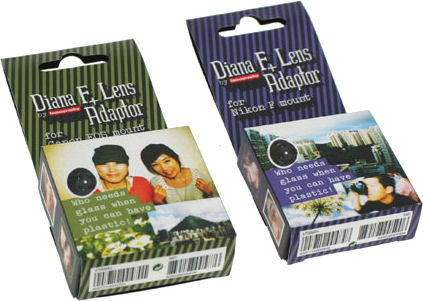
The Diana F+ packaging caught my eye as it was current and sold at the moment. There were different ones to the type of camera and there was various sets which included basic to more extensive parts. They come with a lomo book promoting the photography style and add to the cult. The packaging have characteristics of lomography by using photography and patterns using the main colour of the photo. This would be an appropriate camera to design packaging for as it's popular and sold in high streets shops today.
"Tori" Set Packaging
This is a limited edition of Diana F+ cameras in behalf of Tori Amos. In addition to the "Tori" camera the package includes a set of exchangeable lenses, a limited edition CD, a film roll and a photo taken by the musician herself with a Diana camera. The packaging was inspired by the design of a Bösendorfer piano, as this is her typical instrument on stage.
The "Tori" Set, including its packaging, has been designed in collaboration of Tori Amos, Lomography USA and the Lomography design team. I developed the die cuts and did the final artwork.
I looked more into the packaging of cameras after taking an eye to the Polaroid Impossible Project packaging. There was an interesting difference between them all and the stocks varied but was mainly card. I analysed the packaging so I understood the properties that it would need to undertake in order to function appropriately if I was to go in this direction.
Camera Packaging:
The camera packaging is majority rectangular boxes some using a sleeve but the majority of varied packaging is within the box which holds and protects the products inside. They are made with a sturdy and durable corrugated card so the product can be product can be transported and stored safely from manufacturers to stores to homes. It also means easy storage and they are able to stack along one another in transport and shelves.


