Tuesday 30 April 2013

Context of Practice: Development of LookBook

I used phrases and atheistic of Barber Kruger work throughout my lookbook turning all her phrases into consumerism related captions to products..


I used this image of the model showing the sunglasses as her face was tilted to the side and she has a similar expression to that of Krugers statue.


This phrase I captioned a bag with as accessories such as bags are seen as outfit statement pieces that people 'fall' in love with and spend a lot of money on.


Again this is in the accessory section as they are supposed to decorate the body and outift.


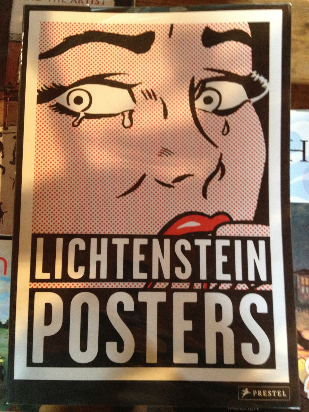
This one I saw the connection between a piece of pop art of Litchenstein which was another key aspect to the design atheistic and therefore overlaid the caption on different imagery.


This I thought could be used in connection with the fact that Japan is coming over to Britain.


I twisted the phrase to the sock range exaggerating on a small detail.


Again this is a phrase commonly used with the purchasing of products and therefore I attached it to a large bag as they are normally extravagant prices.


I warped this pop art image so her face was less worried and sad, more of a mixed expression where she appears sad but when you read the caption you realise that it's actually a happy crying and an extreme emotion towards shoes.


I realised that this pop art image of the ring was good for the accessory section and sold the ideal of marriage and love like adverts do with models looks and perfect situations/moments. I then made the connection of how it was like Michael Angelo's 'Creation of Adam'. After researching it to find out what the purpose of the painting was I tried to find an appropriate phrase which would make the connection between the creation of man made in the image and likeness of god and the accessory range. 


Japanese translation:
I used key quotes I sourced for my essay in specific places in the publication so they related to the imagery.


This is the fold out page of the lookbook. I chose to do a fold out page of the hats as they are all exactly the same but different colours. The way the page folds out shows the repetition and reproduction of the same mass produced goods.

Using part of Kruger's Selfridges campaign I put this phrase on the reverse of the fold out in the pop art style I had used for the imagery so it's almost subliminal like the manipulation in consumer culture and advertising.

Close up of the dots:


What didn't work:

I tried putting the Japanese text in a box like Kruger's phrases but it didn't look as good as I had hoped.


I also thought that the red was in stark contrast to some of the other pages on the spread so I tried creating it in the same colour scheme but it wasn't very clear at all especially in comparison to the red.

Thursday 25 April 2013

Context of Practice: Lookbook Theory

In order to input more theory into my publication and in someway explain what the purpose of it is I thought to look at the beginning of other lookbooks to see how there introduction paragraphs are phrased and what they discuss.


http://www.penfield.com/us/spring_summer_2012_lookbook


http://www.facebook.com/media/set/?set=a.424544047611117.91685.125828910815967&type=3

http://issuu.com/monsoon-accessorize/docs/mon_lookbook_ss13_final


Monday 22 April 2013

Design Practice 2: Invisible inks


1.
Lemon Juice

Lemon Juice
Lemon juice is a great example of a ‘heat-fixed’ invisible ink. An invisible lemon juice message, scrawled onto a piece of paper, can be developed by exposure to any heat source such as a radiator, an iron or a 100W light bulb.
Many acidic household liquids (Coca Cola, wine, apple, orange and onion juice included) behave in quite the same way, as do a number of bodily fluids. During the Nazi occupation of Poland, people frequently sent postcards containing hidden messages written in saliva and even urine.
Equipment & ingredients: you’ll find them in most local grocers
Suitable for: anyone
Ease of use: really easy

http://www.cartridgesave.co.uk/news/7-amazing-types-of-invisible-ink-how-you-can-use-them/

Invisible Ink with Lemon Juice
Making invisible ink is a lot of fun, you can pretend you are a secret agent as you keep all your secret codes and messages hidden from others. All you need is some basic household objects and the hidden power of lemon juice.
What you'll need:
  • Half a lemon
  • Water
  • Spoon
  • Bowl
  • Cotton bud
  • White paper
  • Lamp or other light bulb

Instructions:
  1. Squeeze some lemon juice into the bowl and add a few drops of water.
  2. Mix the water and lemon juice with the spoon.
  3. Dip the cotton bud into the mixture and write a message onto the white paper.
  4. Wait for the juice to dry so it becomes completely invisible.
  5. When you are ready to read your secret message or show it to someone else, heat the paper by holding it close to a light bulb.

What's happening?
Lemon juice is an organic substance that oxidizes and turns brown when heated. Diluting the lemon juice in water makes it very hard to notice when you apply it the paper, no one will be aware of its presence until it is heated and the secret message is revealed. Other substances which work in the same way include orange juice, honey, milk, onion juice, vinegar and wine. Invisible ink can also be made using chemical reactions or by viewing certain liquids under ultraviolet (UV) light.

http://www.sciencekids.co.nz/experiments/invisibleink.html


Due to the ink I found that developed in the light possibly not working due to it developing as it dried I looked at other alternatives. Lemon juice can be used as an invisible ink that can be seen when lifted to the light. This doesn't develop into an image but does kind of represent the idea of negatives being seen in the light.


Context of Practice: Saltaire Mill Bookshop

I went to saltaire mill's bookshop and found some lovely books on pop art, in particular Lichtenstein. I looked at how the idea of his work was translated across to the layout and the atheistic of the text and images in the publication as to influence my own design decisions in getting across the atheistic of pop art in my own. I also picked out key images that I liked and thought could be translated across to images of Fashion e.g. the can being sprayed could be perfume and the ring part of jewellery and accessories.


I also found this publication on graffiti street art and stencils interesting due to it's concept of having the stencil sized to the book and placed between the information and the photography of the stencil in context. This adds a bit of interest to the book and makes it different by breaking up the information with this more interactive page. Users could use the stencils themselves if they removed them from the publication. It shows how the content of the book can be translated into the format and stock of the publication.


Friday 12 April 2013

Context of Practice: Japanese Binding


I have chosen to bind my lookbook using the Japanese binding as the origin of the brand is going to be from Japan. This brings the culture into the design of the book.


I've decided to also use the Japanese B5 format size for the lookbook as I wanted it to be smaller than A4 but bigger than A5 and when looking for Japanese format sizes I found one which fitted perfectly between the two.

Thursday 11 April 2013

Context of Practice: Fashion Graphics Book

Book
Fashion Graphics - Tag/Invitation/Lookbook/Package/Advertising
Laura Baruel

 Photography which fits the fold out divides
 Use of colour in the form of binding the pages
 Creating 2d and 3d design - making it interactive
 Constantine fold out
 The fold and format reflecting the ranges style
 Use of bold colour in pages
 Different format sizes with revealing parts
 The use of a strong colour across the publication
 Die cut windows revealing the content

 Die cut text and embossing on stock
I love the use of a clothing label being used as part of the design with the same stock and the symbols for care of the product.
Tracing paper separating the photography and pages
 Coloured edging of stock - bold and subtle use of colour