
Laws of Simplicity
Sun, Dec 3, 2006
Over the next two weeks I will be reviewing John Maeda’s ten Laws of Simplicity. His book takes an academic approach to the topic. Maeda is a professor at MIT’s Media Lab. His writing is both philosophical and practical. True to keeping it simple, the book is short (100 pgs) and an easy read.
I love this definition:
“Simplicity is about subtracting the obvious and adding the meaningful.”
That quote is also the tenth law, which boils down he other nine into one. But I’ve got ahead of myself. I have more to say in the links below, as I relate Maeda’s laws to the Web.
- Law 1: Reduce
Law 2: Organize
Law 3: Time
Law 4: Learn
Law 5: Differences
Law 6: Context
Law 7: Emotion
Law 8: Trust
Law 9: Failure
Law 10: The One
http://www.adamduvander.com/simple/laws-of-simplicity
http://www.amazon.com/exec/obidos/ASIN/0262134721/duvinci-20
Law 1: Reduce
Mon, Dec 4, 2006
This is part of a series looking at John Maeda’s ten Laws of Simplicity.
“The simplest way to achieve simplicity is through thoughtful reduction.”
This is the crux of most simplification. If something is not needed in a site’s global navigation, for example, get rid of it. There is a reason that most home pages are not entire site maps. Showing everything is not the simplest way to show an interface.
Google is an overused example. Yet, I go to it here because it’s so appropriate. When they brought the bare page with only a search box to the Web, Yahoo!’s front page was essentially a site map. Thoughtful reduction, in this case, meant removing everything not related to the aim of searching. They even auto-focused the cursor to the input box!
That’s not to say Yahoo! doesn’t try.
They used to have a drop-down box with choices for what to search: The Web, In Images, In Yellow Pages, In Products. It went away earlier this year, probably because it wasn’t really that useful. Removing it (or rather replacing it with the version shown in the multi-goal search box) was thoughtful reduction on Yahoo!’s part, even if it was a bit superfluous in the first place.
Recently, Joel Spolsky wrote about the Windows Vista shutdown menu:
The fact that you have to choose between nine different ways of turning off your computer every time just on the start menu… Can anything be done? It must be possible. iPods don’t even have an on/off switch.
By reducing, Spolsky got down to one option: shutdown. I think he went too far and made the menutoo simple when he removed the restart option. As many Windows users know, that is often the best solution to a wacky computer problem. Shutting down and starting back up usually involves pushing a button on the machine itself, which sometimes means crawling under desks.
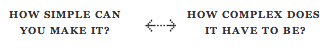
Nevertheless, Spolsky’s process shows how thoughtful reduction is a great approach to simplification. Taking it too far is part of that process, too. Maeda uses continuums (like the one pictured here) to explain the give and take of finding the balance point. You know you’ve gone too simple when you realize it needs to be a little more complex. And you know it’s too complex when you can make it simpler without losing something necessary in the process.
Law 2: Organize
Tue, Dec 5, 2006
This is part of a series looking at John Maeda’s ten Laws of Simplicity.
“Organization makes a system of many appear fewer.”
This law comes down to basic cataloging. Find like elements and put them together. Maeda uses the ol’ screenwriter trick of placing one thought/item on an index card. Then the cards can be moved around until you find the right groupings.
At BestPlaces we’re continually honing in on the best way to show all the data we have on every city and zip code in the US. The most important step was organizing the data into categories. To show air quality, average precipitation, and unemployment rate right next to each other would be confusing. Organizing them into health, climate, and economy sections goes a long way to simplifying what we’re showing.
USDA’s Haynet was able to boil their entire site down to two links: have hay and need hay.

I’ve harped on this before as being too simple. My main beef with it is that it’s not a template that translates to other sites very well. When architects have emulated the Haynet approach, they lost something in their simplicity.
A later law does a good job of explaining my problem with Have Hay / Need Hay. As far as organization goes, one can’t get much simpler.
As I mentioned yesterday, Maeda explains many of his laws with continuums between conflicting factors. It seems to me that as we nudge one way with one law, we cause a reaction that moves other laws. It’s a delicate balance that should be embraced, because with the process comes simplicity. Organizing is a big part of that process.
Law 3: Time
Wed, Dec 6, 2006
This is part of a series looking at John Maeda’s ten Laws of Simplicity.
“Savings in time feels like simplicity.”
Web design gurus have preached this law since the mid-90s. Watch your file sizes! Beware the total site “weight!” they warned. These are still excellent strategies for savings time, though broadband penetration means we don’t have to be quite as militant.
Ajax has opened up a whole new time-saving tool bag. Using Javascript, developers can limit the apparent roundtrips to the server that require an entire page to reload when only a small portion has changed.

In reality there is still a roundtrip going on, but it happens in the background. And it doesn’t have to return the header graphic, navigation, and other items the user already is seeing. Instead, it returns the smallest amount of information needed, saving time.
Better yet, it feels like we’re saving even more time. With a traditional roundtrip, the screen goes blank for just an instant, but it feels longer. What simplicity really gets down to is perception. If it seems slow, then it can’t be simple.
Taking perception a step further, Ajax developers have added small animations to display during the short wait:


Here’s a whole gallery of them.
Here’s a whole gallery of them.
Of course, progress bars aren’t new. They existed on Expedia and their ilk well before Ajax was around. Travel sites didn’t invent them, either, as they’ve been a staple of slow desktop operations for years. Heck, maybe old school programmers got the idea from “please take a number” signs at the deli.
In all these cases, we have a glimpse of action. When the end is in sight, the wait seems shorter. The shorter, the simpler.
(What I’ve left out here, for simplicity’s sake, is a whole other side of time savings. Fill in the gaps yourself by considering how online banking has saved us all so much time.)
Law 4: Learn
Thu, Dec 7, 2006
This is part of a series looking at John Maeda’s ten Laws of Simplicity.
“Knowledge makes everything simpler.”
One reason I really like the Laws of Simplicity is because each one is important to the whole package. When I first read this law, I thought it was a cop-out. As a Web developer, I accept at least a partial truth to the claim that people don’t read directions. At a glance, this law says, “just tell them how it is and suddenly it’s easier because they know now.”
Learning has to happen somehow. It’s not the responsibility of this law to say how that happens. Hopefully the other laws make the knowledge transfer implicit.
It’s also worth acknowledging how much our users already know. Most sites don’t need to explain how to click links or fill out forms. Instead, the basic navigation style and layout of sites are similar because that’s what the users expect.
To me, the law of knowledge says to consider what your users already know. Once you have a group on their current knowledge, you can use the other laws to help them learn what they don’t know.
I think of the small technical lessons I have given my father. Perhaps the biggest was copying and pasting. The next biggest might have been the shortcuts to copy and paste. Those small bits of knowledge create a much simpler experience.
Two years ago, The Wheeze encouraged me to read Web sites in a feed reader. Taking the time to learn that process greatly changed the way I consume information. Now I probably track five times the sites in half the time.
As these examples show, this fourth law of learning works in tandem with the third law, time. Once you know something, you save time, which directly equates to simplicity.
Law 5: Differences
Fri, Dec 8, 2006
This is part of a series looking at John Maeda’s ten Laws of Simplicity.
“Simplicity and complexity need each other.”
If everything was simple, nothing would be simple. We appreciate simplicity only because we can compare it to complexity. The iPod and Google, ever the popular examples of simplicity, would not have succeeded if there weren’t some pretty bad (read: complex) competition.
Like many opposites, simple and complex aren’t that different. Many times, the simple thing just disguises very complex things going on behind the scenes. Millions of non-programmers type words into search engines every day. These same people have no idea about what it takes to create an index that is able to return results in a fraction of a second.
In the first law, we learned about thoughtful reduction. In that process, we consider what is most important. Then we highlight those things. Similarly, organizing is about deciding what groups are important and what they should contain. If everything is important, nothing is. The law of differences acknowledges that in order to achieve simplicity, we must have complexity.
Law 6: Context
Mon, Dec 11, 2006
This is part of a series looking at John Maeda’s ten Laws of Simplicity.
“What lies in the periphery of simplicity is definitely not peripheral.”
Maeda is a designer and this is a designer’s chapter. Of course, designers already understand the importance of the periphery. If you think the design process is nothing more than making something look pretty, you’re a great candidate to read on.
Like some earlier chapters, Maeda provides a helpful continuum to explain the law of context:
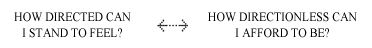
Somewhere in between the extremes is a place Maeda calls “comfortably lost.” It’s going to be different depending on the Web site. If it’s promoting a rapper’s new album, users are more willing (perhaps hoping) to be less directed. If it’s IRS.gov, then “just the facts, ma’am.”
It essentially comes down to ambiance. Maeda gives a great non-Web example about hiking a subtly-marked trail:
“I personally experiences this sensation of being “comfortably lost” on a recent vacation hike in Maine. I noted that the trails were marked with rectangles of bright blue paint. Each of the trails was highly navigable due to its good condition, but once in a while I would pause and wonder, “Where do I go next?” Almost like magic one of these blue markers that previously sat in the background of my perceptual field literally “popped” into the foreground.”
I think this law explains why “Have hay / Need hay” offends me (mentioned here). When it is translated to other types of sites they are too directed. Too dry. They become the equivalent of plastering blue signs on every inch of a forest hike.
Maeda concludes:
“At some point, with successive addition of more sophisticated elements, the true value of the untainted forest suddenly vanishes.”
The law of context says a designer should let visitors, whether to a Web site or state park, feel “comfortably lost.” Maybe that is the “feel” half of “look and feel?”
Law 7: Emotion
Tue, Dec 12, 2006
This is part of a series looking at John Maeda’s ten Laws of Simplicity.
“More emotions are better than less.”
Get ready designers. Like the law of context, this chapter is for you. The law of emotion makes flair okay. It allows for the flash intro and might even forgive MySpace their misgivings.
Okay, so designers won’t like that entire list, but Maeda is very specific:
“When emotions are considered above everything else, don’t be afraid to add more ornament or layers of meaning.”
Maeda admits that this appears to contradict reduction, the first law. To make sense of this, I imagine the simplest web page possible. I picture a heading and some text, all black on a white background.

A blank page might be simpler, but reduction is also about being as complex as necessary. Most designers, I would guess, would want to add something to the above Web page. If I took a poll of what it needs, I’d guess the number one answer would be color. Why?
As the law of context showed on the hiking trail, color can help point the way. The law of differences would say we need multiple colors to provide proper contrast between unlike elements. Indeed, white text on a white background would not be complex enough. Folding in the law of organize, it would be perfectly appropriate to use colors to separate different categories.

Still, I bet most designers would want to add to this. They would want different colors, or some sort of graphic. Asked why, one might say, “it just feels right.”
That is the law of emotion. If you are still skeptical, Maeda gets much deeper into it in his book.
Law 8: Trust
Wed, Dec 13, 2006
This is part of a series looking at John Maeda’s ten Laws of Simplicity.
“In simplicity we trust.”
This is my favorite chapter. It explains a connection between usability and simplicity that I always knew was there, but never tried to figure out. It also foreshadows privacy issues that are bound to be a bigger deal in 2007 and beyond.
Usability as trust
Like trust in people, in order for a Web site to gain trust it has to prove itself deserving. The other laws help because something simple to use is easier to trust.
Like trust in people, in order for a Web site to gain trust it has to prove itself deserving. The other laws help because something simple to use is easier to trust.
There are a lot of Web sites that feel “breakable.” I have even built some of them. Many mistakes can cause that feeling: ugly designs, layout bugs, and shoddy error checking, to name a few. When users run into a problem it makes a little chink in the trust armor. A couple of those and users start seeing chinks where there is no defect.
When a Web site fails gracefully, this builds trust–especially when the error is fixable and non-fatal. Maeda devotes two pages to the concept of “undo:”
Computer tools give us the option to undo often, and no infinitely. Digital media is a forgiving media. Any visual mark, spoken utterance, or typed word entered into a the digital domain can just as easily be removed.
Undo on the Web is not nearly as ubiquitous as in desktop applications. In fact, I’d say it is nearly non-existant. At best, most Web sites only provide an undocumented and makeshift re-do option, where you can backtrack your steps and do it right.
Privacy as trust
Another side of trust is that it is increasingly common is related to personal data. Briefly at the end oflaw three I mentioned how much time we save by banking online. That greatly simplifies checking balances and transferring money between accounts. Online banking only works if we trust our data to the banks. They need to either keep us safe or keep our financials off the Web.
Another side of trust is that it is increasingly common is related to personal data. Briefly at the end oflaw three I mentioned how much time we save by banking online. That greatly simplifies checking balances and transferring money between accounts. Online banking only works if we trust our data to the banks. They need to either keep us safe or keep our financials off the Web.
There are also other types of personal data that could be just as harmful in the wrong hands. The same information can be used to give us better browsing experiences.
Maeda gives us a trust continuum:

The left side, how much you need to know, is covered in usability above and law four, learn. As we get smarter stuff, the need to learn will decrease. With more of our services online, we’ll likely start questioning the right side of the continuum. How much does the system need to know about me?
If tools ask for too much, they’ll lose some of the trust they’ve built up. If tools get too personal before building trust, they’ll lose users before they even get a chance to build trust.
Law 9: Failure
Thu, Dec 14, 2006
This is part of a series looking at John Maeda’s ten Laws of Simplicity.
“Some things can never be made simple.”
This is for the simplicity haters who insist on poking holes because simplicity does not work exactly the same in every situation. An earlier law says simple can’t exist with the complex. The law of failure says that some things can’t be simple.
Attempting to simplify a complex procedure is reasonable. It may end in failure or it could lead to a more usable product. Maeda says there is a “Return on Failure,” too. When I fail and I take the time to find out why, I learned a great lesson I can use later on. So, either I have made something simpler, or I have knowledge to help me do so in the future.
Google Maps revolutionized online mapping with its time-saving click-and-drag interface. The product was introduced in 2005, but would have ended in failure any time earlier because browser differences were so much greater.
Similarly, I worked a long time on creating Javascript sliders for BestPlaces in 2002. I made some that worked okay, but they were just too buggy cross-browser. Today, something similar is part of theYahoo! UI Library.
In another turn for the simplicity haters, Maeda admits some failures of his book. The first four laws are filled with acronyms. The mnemonics didn’t really work for me, so I didn’t include them here.
The laws of differences, context, emotion, and trust are less logical and applicable compared to earlier laws. They are a little more touchy-feely, explaining more about the why than the how.
Maeda explains…
As the Laws progress in the book, the themes become increasingly ambiguous. In the second Law I introduce the concept of gestalt–or the ability of the mind to “fill in the blank”–which justifies my approach to allow creative interpretation. However this open explanation can be confusing if taken logically.
The final flaw Maeda mentions with his approach to simplicity is that there are too many laws. He fixes that with the final law, The One, which boils down Simplicity into a single sentence.
Law 10: The One
Thu, Dec 14, 2006
This is part of a series looking at John Maeda’s ten Laws of Simplicity.
“Simplicity is about subtracting the obvious and adding the meaningful.”
With a great definition like that, it should be clear why I think simplicity is everyone’s job. There is enough complexity in the world without even trying. The more meaningful sites we can add to the Web, the better.
With this single law, he fixes a failure he acknowledged in the ninth law:
“Simplicity is hopelessly subtle and many of its defining characteristics are implicit (noting that it hides in simplicity)… When in doubt, turn to the tenth law: the one. It’s simpler that way.
When something is too obvious, it’s probably unneeded. With the obvious removed, the meaningful comes into view. Here are the other nine laws of simplicity, stated in terms of The One:
| Reduce | Removes unneeded features. |
| Organize | Saves some of the features for when needed. |
| Time | Speeding up a process removes unneeded waste of time. |
| Learn | Remove unneeded confusion by explaining. |
| Differences | If everything is meaningful, nothing is. |
| Context | Make the meaningful subtle. |
| Emotion | Sometimes something can be obvious and meaningful. |
| Trust | When we trust that we’re seeing something meaningful, even more can be removed. |
| Failure | Sometimes with only the meaningful remaining, it’s still complex. |
http://www.adamduvander.com/simple/laws-of-simplicity
authors website: http://lawsofsimplicity.com/
REDUCE
Muji

ORGANISE
Twofers Are More as Less

No comments:
Post a Comment