
John Maeda
From Wikipedia, the free encyclopedia
| John Maeda | |
|---|---|
 | |
| Born | 1966 (age 45–46) Seattle, Washington |
| Nationality | American |
| Alma mater | Massachusetts Institute of Technology (SB, SM) Tsukuba University (PhD) |
| Occupation | Graphic designer, computer scientist, university professor, and author |
| Children | 5 daughters |
John Maeda (born 1966 in Seattle, Washington) is a Japanese-American graphic designer, computer scientist, university professor, and author. His work in design and technology explores the area where the two fields merge. He is the current President of the Rhode Island School of Design.[1]
Maeda was originally a software engineering student at the Massachusetts Institute of Technology, when he became fascinated with the work of Paul Rand and Muriel Cooper. Cooper was a director of MIT's Visual Language Workshop. After completing his bachelors and masters degrees at MIT, Maeda studied in Japan at Tsukuba University's Institute of Art and Design to complete his Ph.D. in design.
In 1999, he was named one of the 21 most important people in the 21st century by Esquire.[2] In 2001, he received the National Design Award for Communication Design in the United States and Japan's Mainichi Design Prize.[3] He is a Senior Fellow of theDesign Futures Council.[4]
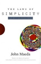
In 2006, Maeda published Laws of Simplicity, his best-selling book to date, based on a research project to find ways for people to simplify their life in the face of growing complexity.
http://en.wikipedia.org/wiki/John_Maeda
Inspiration
Paul Rand
From Wikipedia, the free encyclopedia
Not to be confused with Rand Paul.
| Paul Rand | |
|---|---|
 Paul Rand on a Think Different poster in his later years | |
| Born | August 15, 1914 Brooklyn, New York, United States |
| Died | November 26, 1996 (aged 82) |
| Occupation | Graphic designer |
Paul Rand (born Peretz Rosenbaum, (August 15, 1914 — November 26, 1996) was an American graphic designer, best known for his corporate logo designs, including the logos for IBM, UPS, Enron, Westinghouse, ABC, and Steve Jobs’ NeXT. He was one of the originators of the Swiss Style of graphic design.
Rand was educated at the Pratt Institute (1929–1932), Parsons The New School for Design (1932–33), and the Art Students League (1933–1934). From 1956 to 1969, and beginning again in 1974, Rand taught design at Yale University in New Haven, Connecticut. Rand was inducted into the New York Art Directors Club Hall of Fame in 1972. Rand died of cancer in 1996 in Norwalk, Connecticut.[1] He is buried in Beth El Cemetery.[2]
[edit]Biography
Early life and education
Paul Rand was born on August 15, 1914 in Brooklyn, New York.[3] He embraced design at a very young age, painting signs for his father’s grocery store as well as for school events at P.S. 109.[4] Rand’s father did not believe art could provide his son with a sufficient livelihood, and so he required Paul to attend Manhattan’s Harren High School while taking night classes at the Pratt Institute, Rand was largely “self-taught as a designer, learning about the works ofCassandre and Moholy-Nagy from European magazines such as [Gebrauchsgraphik].”[5]
[edit]Early career
His career began with humble assignments, starting with a part-time position creating stock images for a syndicate that supplied graphics to various newspapers and magazines.[4]Between his class assignments and his work, Rand was able to amass a fairly large portfolio, largely influenced by the German advertising style Sachplakat (object poster) as well as the works of Gustav Jensen. It was around this time that he decided to camouflage (and abbreviate) the overtly Jewish identity telegraphed by ‘Peretz Rosenbaum,’ shortening his forename to ‘Paul’ and taking ‘Rand’ from an uncle to form his new surname. Morris Wyszogrod, a friend and associate of Rand, noted that “he figured that ‘Paul Rand,’ four letters here, four letters there, would create a nice symbol. So he became Paul Rand."[3] Roy R. Behrens notes the importance of this new title: “Rand’s new persona, which served as the brand name for his many accomplishments, was the first corporate identity he created, and it may also eventually prove to be the most enduring."[3] Indeed, Rand was rapidly moving into the forefront of his profession. In his early twenties he was producing work that began to garner international acclaim, notably his designs on the covers of Direction magazine, which Rand produced for no fee in exchange for full artistic freedom.[4] Among the accolades Rand received were those of Laszlo Moholy-Nagy:
| “ | Among these young Americans it seems to be that Paul Rand is one of the best and most capable [. . .] He is a painter, lecturer, industrial designer, [and] advertising artist who draws his knowledge and creativeness from the resources of this country. He is an idealist and a realist, using the language of the poet and business man. He thinks in terms of need and function. He is able to analyze his problems but his fantasy is boundless.[4] | ” |
The reputation Rand so rapidly amassed in his prodigious twenties never dissipated; rather, it only managed to increase through the years as the designer’s influential works and writings firmly established him as the éminence grise of his profession.[5]
Although Rand was most famous for the corporate logos he created in the 1950s and 1960s, his early work in page design was the initial source of his reputation. In 1936, Rand was given the job of setting the page layout for an Apparel Arts magazine anniversary issue.[4] “His remarkable talent for transforming mundane photographs into dynamic compositions, which [. . .] gave editorial weight to the page” earned Rand a full-time job, as well as an offer to take over as art director for the Esquire-Coronet magazines. Initially, Rand refused this offer, claiming that he was not yet at the level the job required, but a year later he decided to go ahead with it, taking over responsibility for Esquire’s fashion pages at the young age of twenty-three.[6]
The cover art for Direction magazine proved to be an important step in the development of the “Paul Rand look” that was not as yet fully developed.[4] The December 1940 cover, which uses barbed wire to present the magazine as both a war-torn gift and a crucifix, is indicative of the artistic freedom Rand enjoyed at Direction; in Thoughts on Design Rand notes that it “is significant that the crucifix, aside from its religious implications, is a demonstration of pure plastic form as well . . . a perfect union of the aggressive vertical (male) and the passive horizontal (female)."[7]
[edit]Corporate identities

Rand’s most widely known contributions to design are his corporate identities, many of which are still in use. IBM, ABC, Cummins Engine, UPS, and the now-infamous Enron, among many others, owe Rand their graphical heritage.[5] One of his strengths, as Moholy-Nagy pointed out,[4] was his ability as a salesman to explain the needs his identities would address for the corporation. According to graphic designer Louis Danziger:

| “ | He almost singlehandedly convinced business that design was an effective tool. [. . .] Anyone designing in the 1950s and 1960s owed much to Rand, who largely made it possible for us to work. He more than anyone else made the profession reputable. We went from being commercial artists to being graphic designers largely on his merits.[4] | ” |
Rand’s defining corporate identity was his IBM logo in 1956, which as Mark Favermann notes “was not just an identity but a basic design philosophy that permeated corporate consciousness and public awareness."[8] The logo was modified by Rand in 1960. The striped logo was created in 1972. The stripes were introduced as a half-toning technique to make the IBM mark slightly less heavy and more dynamic. Two variations of the "striped" logo were designed; one with eight stripes, one with thirteen stripes. The bolder mark with eight stripes was intended as the company's default logo, while the more delicate thirteen stripe version was used for situations where a more refined look was required, such as IBM executive stationery and business cards. Rand also designed packaging, marketing materials and assorted communications for IBM from the late 1950s until the late 1990s, including the well known Eye-Bee-M poster.Ford appointed Rand in the 1960s to redesign their corporate logo, but afterwards chose not to use his modernized design.[6]
Although his logos may be interpreted as simplistic, Rand was quick to point out in A Designer’s Art that “ideas do not need to be esoteric to be original or exciting."[7] His American Broadcasting Company trademark, created in 1961, then used by ABC-TV in the fall of 1962, epitomizes that ideal of minimalism while proving Rand’s point that a logo “cannot survive unless it is designed with the utmost simplicity and restraint.”[7] Rand remained vital as he aged, continuing to produce important corporate identities into the eighties and nineties with a rumoured $100,000 price per single solution.[5] The most notable of his later works was his collaboration with Steve Jobs for the NeXT Computer corporate identity; Rand’s simple black box breaks the company name into two lines, producing a visual harmony that endeared the logogram to Jobs. Steve Jobs was pleased: just prior to Rand’s death in 1996, his former client labelled him, simply, “the greatest living graphic designer.”[3]
[edit]Influences and other works
[edit]Development of theory
Though Rand was a recluse in his creative process, doing the vast majority of the design load despite having a large staff at varying points in his career, he was very interested in producing books of theory to illuminate his philosophies. László Moholy-Nagy may have incited Rand’s zeal for knowledge when he asked his colleague if he read art criticism at their first meeting. Rand said no, prompting Moholy-Nagy to reply “Pity.”[4] Heller elaborates on this meeting's impact, noting that, “from that moment on, Rand devoured books by the leading philosophers on art, including Roger Fry, Alfred North Whitehead, and John Dewey."[4] These theoreticians would have a lasting impression on Rand’s work; in a 1995 interview with Michael Kroeger discussing, among other topics, the importance of Dewey’s Art as Experience, Rand elaborates on Dewey’s appeal:
| “ | [. . . Art as Experience] deals with everything -- there is no subject he does not deal with. That is why it will take you one hundred years to read this book. Even today's philosophers talk about it[.] [E]very time you open this book you find good things. I mean the philosophers say this, not just me. You read this, then when you open this up next year, that you read something new.[9] | ” |
Dewey is an important source for Rand’s underlying sentiment in graphic design; on page one of Rand’s groundbreaking Thoughts on Design, the author begins drawing lines from Dewey’s philosophy to the need for “functional-aesthetic perfection” in modern art. Among the ideas Rand pushed in Thoughts on Design was the practice of creating graphic works capable of retaining recognizable quality even after being blurred or mutilated, a test Rand routinely performed on his corporate identities.[7]
[edit]Criticism
During Rand's later career, he became increasingly agitated about the rise of postmodernist theory and aesthetic in design. In 1992, Rand resigned his position at Yale in protest of the appointment of postmodern and feminist designer Sheila Levrant de Bretteville, and convinced his colleague, Armin Hofmann to do the same.[10] In justification of his resignation, Rand penned the article Confusion and Chaos: The Seduction of Contemporary Graphic Design where he denounced the postmodern movement as "faddish and frivolous" and "harbor[ing] its own built-in boredom".
Despite the importance graphic designers place on his book Thoughts on Design, subsequent works such as From Lascaux to Brooklyn (1996), compounded accusations of Rand being “reactionary and hostile to new ideas about design.”[4] Steven Heller defends Rand’s later ideas, calling the designer “an enemy of mediocrity, a radical modernist” while Favermann considers the period one of “a reactionary, angry old man.”[4][11] Regardless of this dispute, Rand’s contribution to modern graphic design theory in total is widely considered[6] intrinsic to the profession’s development.
[edit]Modernist influences
The core ideology that drove Rand’s career, and hence his lasting influence, was the modernist philosophy he so revered. He celebrated the works of artists from Paul Cézanne to Jan Tschichold, and constantly attempted to draw the connections between their creative output and significant applications in graphic design.[12] In A Designer’s Art Rand clearly demonstrates his appreciation for the underlying connections:
| “ | From Impressionism to Pop Art, the commonplace and even the comic strip have become ingredients for the artist’s cauldron. What Cézanne did with apples, Picasso with guitars, Léger with machines, Schwitters with rubbish, and Duchamp with urinals makes it clear that revelation does not depend upon grandiose concepts. The problem of the artist is to defamiliarize the ordinary.[13] | ” |
This idea of “defamiliarizing the ordinary” (or "making the familiar strange," a strategy commonly credited to Russian Formalist critic Viktor Shklovsky) played an important part in Rand’s design choices. Working with manufacturers provided him the challenge of utilizing his corporate identities to create “lively and original” packaging for mundane items, such as light bulbs for Westinghouse.[14]
[edit]
Muriel Cooper
From Wikipedia, the free encyclopedia
Muriel Cooper (1925–1994) was a digital designer, business woman, researcher, and educator.
Cooper received her BA from Ohio State in 1944, and a BFA in Design and a BS in Education from Massachusetts College of Art.[1] After her graduation, Cooper moved to New York City and attempted to find a position in advertising. She met Paul Rand who was influential to her way of life typography.[2]
In 1952, Cooper became the first art director of the Massachusetts Institute of Technology office of publication originally known as Design Services, which later became MIT Press. After teaching at MIT for six years, Cooper left in 1958 to take a Fullbright Scholarship in Milan; this allowed Muriel Cooper to lecture and conduct research in a wide variety of academic and professional fields, and to participate in seminars.[3]
When Cooper returned in 1963, she opened an independent graphic studio in Boston, Massachusetts. The MIT Press was among Cooper's various clients, leading to her design of its trademark logo, an abstracted set of seven vertical bars with a play on the vertical strokes of the initial letters. The logo has been called a high-water mark in twentieth century graphic design[4]. As the longtime art director of MIT Press, she promoted the Bauhaus-influenced, modernist look of their books and other publications. Cooper also recruited graphic designer and fellow MassArt alumna Jacqueline Casey to her own lengthy career at MIT, where Casey designed many posters and smaller publications in a modernist style.[5]
In 1967, Cooper returned to a fulltime position at the MIT Press.[6] In addition to being the founder of the office of publications, Cooper took on the position of being the first director of design and media. Having influenced the design of the iconic book Bauhaus (published by MIT Press in 1969), she also made a film rendition of the book. The film attempted to give a speedy version of translating interactive experiences from a computer to paper. This endeavor was her response to the challenge of turning time into space.[7]
Cooper maintained her position with the MIT Press until 1974, and oversaw the release of a series of titles in architecture, economics, biology, computer science and sociology that formed a critical discourse around systems, feedback loops and control.[8]
At 49 years old in 1973, Cooper was already well known in the design industry. Cooper left MIT Press to become one of the co-founders of the MIT Media Lab., where she taught interactive media design as the founder and head of the Visible Language Workshop (VLW).[9] Cooper was recognized as a pioneer in designing and changing the landscape of electronic communication.[9]
In 1994, at the TED 5 conference in Monterey, California, Cooper presented a collection of work that had been recently done by her students in the VLW. The demos demonstrated experiments in dynamic, interactive, computer-based typography, themes which Cooper had been exploring through much of her career.[10]
In addition to Cooper's involvement in the VLW and TED5, she also worked with groups such as Special Interest Group on Computer Human Interaction of the Association for Computing Machines (SIGCHI).[11]
Professor Muriel Cooper died of an apparent heart attack in 1994 at the age of 68, on May 26 at the New England Medical Center. At the time of her death, she was still serving as a professor at the MIT Media Lab. About a year later, a retrospective exhibition at the Media Lab reviewed her life and career.[citation needed]
The Visual Language Workshop founded by Ron MacNeil and co-founded by Muriel Cooper. Cooper pursued a constant examination of graphic production in multiple media. The visible language workshop. Muriel led a team of graduate students and researchers in the search of new forms, methods and techniques for graphic design that were specific to the emerging context of text on a Computer monitor.[12]
[edit]Visual Language Workshop
John Maeda: Innovation is born when art meets science
The technology and design guru argues that for invention to occur, scientists must embrace the art world

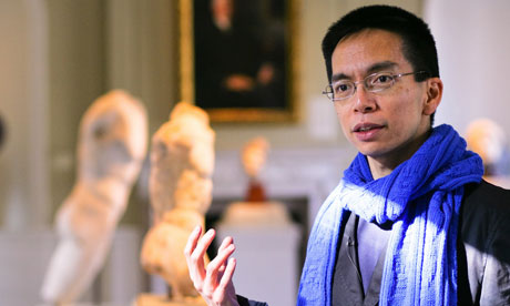
John Maeda at the Rhode Island School of Design Photograph: David O'Connor Photography
A graphic designer and computer scientist, known for his work on the online computer game Second Life, as well as the author of bestselling self-help book The Laws of Simplicity, John Maeda has made great use of dual educations at the Massachusetts Institute of Technology and art school. Drawing from his experiences in these two disciplines, the 44-year-old has come to believe that too stark a distinction is drawn between science and the arts. It is Maeda's conviction that scientists need art and artists in their professional lives in order to invent and innovate successfully, and with a particular focus on education he has toured the world to promote the idea that government-approved "Stem" subjects (science, technology, engineering and maths) should be widened to include art; "turning Stem into Steam," as he puts it. This week Maeda, who is president of the Rhode Island School of Design, will expound on these ideas at an experimental installation at London's Riflemaker gallery, where he will "dispense wisdom from a sandpit". SeeRiflemaker.org for more on this eccentric project.
Why does science need artists?
We seem to forget that innovation doesn't just come from equations or new kinds of chemicals, it comes from a human place. Innovation in the sciences is always linked in some way, either directly or indirectly, to a human experience. And human experiences happen through engaging with the arts – listening to music, say, or seeing a piece of art.
So to help them become more humanist, you'd parachute artists and musicians into laboratories?
Which already happens to some degree with artist-in-residence programmes in scientific labs. They're usually very small, but these programmes are seen as quite desirable by scientists. Because all scientists are humans, and they are humanists inside, and by bringing that part out, innovation happens more naturally.
Can you think of an example where an injection of the arts has helped the sciences?
I recently saw something in Time magazine, a famous Nobel laureate chemist making molecular models out of clay. It shows how these more fluid, abstract materials traditionally belonging to the artist lend themselves better to ways of thinking about the world, as opposed to some kind of ball-and-stick model that shows a constrained view. Art helps you see things in a less constrained space. Our economy is built upon convergent thinkers, people that execute things, get them done. But artists and designers are divergent thinkers: they expand the horizon of possibilities. Superior innovation comes from bringing divergents (the artists and designers) and convergents (science and engineering) together.
Such as?
Look at Apple's iPod. A perfect example of technology – an MP3 player – that existed for a long time but that nobody ever wanted, until design made it something desirable, useful, integrated into your lifestyle. Look at the success of Mint.com [a colourful money-management website] which has recently been sold. It's an app in which 80% of the experience is what you see, how you touch it. Not the technology. I'm also interested in how art and design links into leadership. Because leaders now are facing a very chaotic landscape, things are no longer black and white, things are harder to predict. What better mindset to adopt than the artist's, who is very used to living in an ambiguous space? Real innovation doesn't just come from technology, it comes from places like art and design.
George Osborne recently announced protection in the higher-education cuts for the so-called Stem subjects, but not the arts. Is this blinkered?
You know, it's easy for politicians to look at the measurability of a science and maths education. I mean, fill out 100 questions, you get 100 right or 50 right or zero right, it's easy to measure. There's no test that can give you a score from zero to 100 on the question, "Is this student a good writer?" And society's so focused on measurement. It's awkward and sad. Singapore or Japan are highly known test-taking countries focused on science and engineering, yet are desperate to find innovation. And where are they looking? They're looking to the west for new ideas. It's kind of like a dog chasing after its tail a little bit – this weeding out of the idea that expression, something that exists in the intuition space, can matter. I mean, it's ironic that the people who talk about these kind of things [cuts to the arts] are all counting on things to carry their message – like images, the written word – as givens.
Do you think that scientists tend to lack humanity?
Scientists would say otherwise. But scientists strive to be pure, to live in what's called a "concept space". And by doing so they tend to move away from the core humanist principles that actually put those two arms and legs on them in the first place. The best scientists that I've met are those that are humanists and scientists at the same time.
http://www.guardian.co.uk/technology/2010/nov/14/my-bright-idea-john-maeda
No comments:
Post a Comment