
Cielito Querido Café
I pretty much stopped in my tracks when I spotted this amazing Mexican chain of cafés recently on We Heart. Designed by Esrawe in collaboration with Ignacio Cadena, Cielito Querido Café is right up my alley — everything from the interior to the packaging is drenched in saturated color, pattern and typography. If you like what you see, you can check out some more images and get more information on their Facebook page.


Above images from the Cielito Querido Café website.


All above images are from We Heart. (Unfortunately I can’t find a credit for the photographer, so if you happen to have that info please let me know.)
Sis, Deli and Café
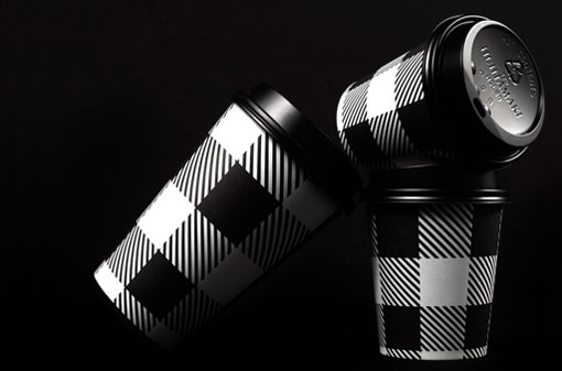
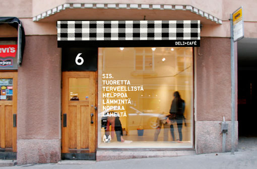
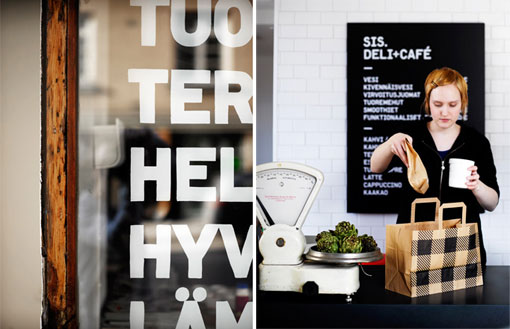
I am in love with the graphic black and white pattern that adorns the identity for Sis Café and Deli by Rasmus Snabb.
http://www.designworklife.com
The black and white appearance is definatly more what I am trying to achieve in my design and concept of deli.
No comments:
Post a Comment