
CARPATHIA - OFFICE HOUSE


I like the white on black of this publication and how a regular format has been twisted slightly to make it more interactive. The layout and finishing of this is similar to what i'd like to achieve with my publication.
Flora; The Foraged Food Restaurant


As my booklet is going to small and short this type of binding and finish would suit. I like the additives of small slips of information in the bind.
A Drop In The Ocean
Remote Island Catalogue
Remote Island Catalogue


The sleek, professional appearance of this and the simple layout is very atheistically pleasing and looks great as a set of different products. I like the small booklets also, they have changed my opinion of this bind as I thought they would just look cheap and not worth keeping but I think they can look more official if printed correctly on specific stock.
JessicaA book all about Jessica Hische


I like how this binding is part of the design also and the red stitching makes a statement and isn't just because of the process.
Untitled


I like the black and white simple layout of this, it makes a massive impact and is engaging to the eye.
Self Promo

The elastic band as a way of containing the book is one I had considered
A World in Words
Language and Social Context
Language and Social Context


This has a different fold to a normal binding publication and also uses the elastic band but in a different way. I don't think this fold will be appropriate because there are to many pages and it would be to long and difficult to handle as well as print on iso paper.
CITITALES
Print/ folding/ poster
Print/ folding/ poster


I like the colour scheme and interactive element of this. They've used the red well against the textured toned paper and black.


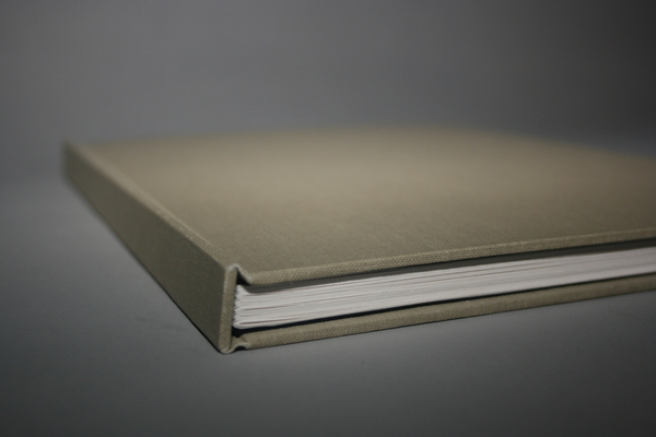
 The application of fabric material as a way of binding like tape binding I think looks visually interesting, especially with the angle on it but also is different to others. This with the use of another unusual material such as wood makes it really stand out. Also the use of black and white is very striking.


Publication: Pause


This is an example of stitch bind. It looks very clean cut and professional however I don't no if it will be appropriate with amount of information I plan on containing.
Kulinarny Atlas Ryb


A small thin booklet, this is what mine when finished will look like format wise.
Roll & Hill Catalogs


This is different kind of binding which I hadnt considered and I think it looks quite visually interesting. They've also used very textured fabricated paper which leaves a nice finish.
Helly Hansen Annual Report


Lecture Notes VOL I


Stitch bound publication with a nice grid layout.
Leeds College of Art Newsletter


Although no relevant to my info pack design interests I thought that this gave a new spin on laying out information with an engaging and interactive format.
Annual report - Craft Victoria


I love the textured element to this paper with the use of tracing paper also, it creates a sensation with the senses.
/behance.com
/behance.com
No comments:
Post a Comment