GOOD
http://www.gentlemensboutique.com/catalog/shoes
I like the display of the products on this website, with the 'window display' photography across the top bar. It has a simple menu bar across the top that stays when you navigate around the site and separates the information of the products and the company to make it easier to source and suit your needs. It also has a nice info graphic of the shoe construction. The products are laid out in a clear grid displaying good photographic representation of them and well as linking to more information and a larger photo displayed in the top bar.
http://madebytemple.com/
This website has a good homepage as it has a clear layout and splits the text with images alternating across from left to right. It also has legible type which is in short sectioned paragraphs and a strict greyscale colour scheme. I like it because its clear, tidy and organised and easy to view the companies work.
http://smart-heart.ru/en/projects/way
I like how they've used the concept idea of 360 for the graphics of the website, i think it's visually interesting but doesn't lose out on the information. I also like the slide bar of snippets of information that then, once clicked, lead down to more detail. The website design follows the natural direction of the eye and website browsing as people often scroll down.
http://www.madebytait.com
This website is set out on a clear grid layout and has a menu that allows you to locate things and move around the website with easy access. You get visual and written information of the products so you can find what your after or browse comfortably. I like how its clear but still interactive and easy to navigate around.
http://smart-heart.ru/
I really like this website because its interactive and engaging and playful but with a purpose. When clicked on it also fades into the main site using the thick line as a follow through part of design.
BAD
http://www.serene-naturist.com/
This website is awful, its got bad colours, messy layout, bad and multiple moving animations, bad picture scaling. The bubbles, butterflies, glittery borders, rolling text, flapping birds with randomly placed images layered all over each other just shouts chaos, no order and no good.
http://www.sixtiespress.co.uk/
As well as being distasteful it has ineligible text particularly in the title with bizarre multicoloured graphics. The text box have black fill which make the writing unclear and different to read. There are also lots of links, a lot snippets of text with no layout or no indication where different sections are. The other pages have a lot of text grouped together and parts that overlap.
http://www.chestertourist.com/morehotels.htm
There is no focus on this website as the navigational buttons have got different colours so your eyes not drawn to them. There hard to read and therefore hard to focus on. They've used a lot of dark colours and contrasts and the body copy is so small its really difficult to read. As well as this the website is disturbed by a lot of advertising which confuses focus and draws attention away from the website making it hard to find whats on the website and whats adverts.
http://www.mrbottles.com/
This website is far to busy, has an annoying man who pops up and talks to you and has ineligible type throughout. The colour of the text makes it hard to read especially over the top of images. It also has far to much information and multiple menu bars that are difficult to understand as it they have large imagery and different text and colours. Theres no focus and direction on this website.
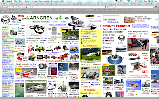
http://www.arngren.net/
This website is possibly the worst i have ever seen. It took so long to load because of all the images and information it had to process. There is absolutely no focus, no control over content or layout. The menubar is structured and stands out on the side due to it being the only organised thing on the page but i think its so daunting that no one would no or want to go about using this website.


No comments:
Post a Comment