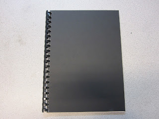
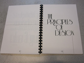
I was relatively happy with my publication, it didn't print exactly how i wanted and didn't line up accurately for cutting unfortunately but for a first attempt at a book i am pleased with the outcome. I attempted to have it binded and foiled like i had originally visualised it however due to restrictions with inductions and time i was able to do this therefore i substituted for the ring bind which was the most practical way of binding my book that was available to me.
Final print:
Crit feedback:
Overall i was very happy with my feedback and people understood what it was trying to communicate and gave very positive comments about my layout: 'visually interesting in a lot of places, simple but exciting." They also though that the black on cream paper was legible and authoritative which was something i was striving for in my design and colour choices so i was glad that came through.
Some areas for improvement that were mentioned i completely agreed with especially in reference to the cover, hard bound book bind. Also the mention of the cover colour being more considered as it wasn't as obvious without the gold text why i had chosen black.
If i was to redo this brief i would hope to have a better print of my book with it bound appropriately to the content in order to communicate the right message and also emboss in gold the title of the book like the official law/religious books. I feel this would of improved my publications communication and enhanced its content purpose. I also would of added an introduction to bring the audience to light and added a conclusion where i would bring together all the information the book had contained.


No comments:
Post a Comment