In order to fulfil this brief I art directed and photographed the shoot at home where I had access to the correct surfaces and resources. Although this did also create limitations and problems.
The Family
I started out with the family narrative of baking. I collected baking ingredients for cupcakes and appropriate instruments used in the making and decorating of the cakes. I then laid these out in a grid like format on kitchen side tiles as this background reinforce the kitchen baking experience.
It was difficult to get the correct lighting across the whole image due to the lack of resources outside of a photographic studio. I also tried editing (see first image) to see if I could improve on the tones and atheistic of the image.
As this wasn't working, I attempted to rearrange the objects to create a more solid grid layout.
After deliberation and lots of development I decided there were two things wrong with this initial concept.
1. The surface behind was to distracting and made it hard to see the individual elements. Also as it had a grid itself it was hard to apply a separate grid on top.
2. There was miss of styles and colours which also made the objects not work so well together
In order to fix this I changed the background to wood which is another typical surface for baking and slightly altered the items to fall under a neutral colour scheme of browns, creams and red.
I also tried rearrangements of this. I took out the branding of the initial image (shown in the flour) and used an alternative unknown brand so the products remain blank.
I struggled with the scales in this arrangement. When something was placed on the scales because it being at a much higher level then the rest of the items it appeared at a much larger scale and effected the grid. I tried various different bowls, items on the scales and rearranging it's placement but none where working in particular for me. Therefore I made the decision to remove the scales as the levelling ruined the grid layout.
For the second image I baked cupcakes myself using the Ikea product. I then originally around these on a tray on the original surface.
Again this didn't work for me due to its busy grid nature so I changed the surface to a white table cloth. I was trying to display the cupcakes as if they were being laid out to eat once baked.
I tried various camera settings to try and improve on the lighting problems I was having. I decided that using the flash on the camera, although focusing the image, was to stark and it wasn't as ambient as the regular lighting.
I decided to go with my original idea and lay the cupcakes out in a grid and on the same background as the first image of the advert. This instantly helped create a unity between the two images and helped show the transformation of the products from one image to the next.
The ambient lighting helped demonstrate the warm atmosphere of the family narrative.
For the final second image I decided to space out the cupcakes further so it appeared more simplified and less compact demonstrating how Ikea make life more simple and spacious.
The Couple
I experimented with various surfaces for the couples images. I tried to think of the most relevant area in which people would leave these items in a hallway. Most items of furniture would be a chair or a table side.
I wanted to try and keep different surfaces for each persona. The dark wood I felt would work better for the single male so I tried an alternative wood surface which was more battered and marked much like a more used item of furniture. I tried to choose items that were both male and female, showing the two different people in the narrative. I also chose items that normally get chucked down and don't really have a place to demonstrate the useful purpose of the product.
I then applied these items more organised to the Ikea product adding an addition product in the plant which Ikea also sell. By using two products for each it shows how the male and female have been joined together. The message from washing up has also transferred to a more kind message of meeting for dinner. This represents how the relationship has now improved from the purchasing of Ikea items.
I also tried different lighting for this shoot. It was hard as the locations for the before and after where in different places and so the natural and artificial light varied.
I was unhappy with the first image surface and items so I decided to try and improve on this. I added more products to show the contrast in the male and female personas.
Again I felt the female seemed very young in the items and the male seemed older. When together in contrast it showed a massive age gap.
I reworked the items to seem more sophisticated and mature such as lip balm turning into lipstick and the magazine turning into lookbook for home interior and swatches (relevant to the narrative of moving in together). I also added in items such as discount post flyers for a pet (another common thing for couples living together), post it notes and business cards.
This worked a lot better and best represented the right personas for the narrative.
Due to the change I then rephotographed the second image with the new items. I also added wine to the shopping list, defiantly appropriate to the age range.
The Female
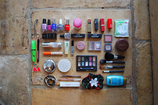
To imitate a bathroom I used tiling for the background. I organised the items into the squares by use such as nail varnishes in one, lipsticks in another.
I then gridded these items outside of the Ikea product.
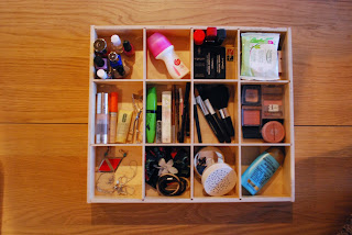
This wasn't working again so I changed the background to wood hoping it would give a more plain surface as there's a lot to focus on. Changing the surface from a bathroom to a dressing table.
I tried using an alternative wood so all the campaigns didn't have the same surface. I also changed the products inside to make it appear more full.
For the first image I only selected a few of the products to lay out as the original image was very busy and hard to focus. This I felt worked very well especially as I formed a square grid like the storage tray.
However I realised that it didn't work because the idea was that the persona needs to be organised by the Ikea product and it seemed more organised before. This led me to creating a more unstructured grid of items and adding more items to make it more busy.
After much deliberation I decided that the initial image worked best and in order to make this work I needed to photograph the second image with only those items so it didn't transfer to an unorganised persona with a more complicated life. This second image now shows how each product has a place for it through the product.
The Male
For the male I used the mahogany wood to show the more business aspect of the narrative. I lay out all the gadget items and wrapped the wires.
This then was transferred to them being hidden in the cable tidy box.However although both images looked good it didn't really show how the cable tidy was that much of an advantage.
Therefore I redid the shoot adding more items and having the wires out and exposed. Certain additional items, such as the lamp, also help show the office side to the persona rather than just a general desk. I kept the cultures natural again using browns, white and greys to create a unity in the items.
This then made much more a difference when transferred into the cable tidy.


No comments:
Post a Comment