Modernist Graphics
Jan Tschichold
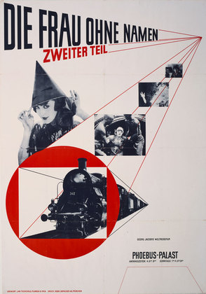
Die Frau ohne Namen. 1927
Offset lithograph
48 3⁄4 x 34" (123.8 x 86.4 cm)
The Museum of Modern Art. Peter Stone Poster Fund
Die Frau ohne Namen. 1927
Offset lithograph
48 3⁄4 x 34" (123.8 x 86.4 cm)
The Museum of Modern Art. Peter Stone Poster Fund
THE NEW TYPOGRAPHY
December 23, 2009–July 12, 2010
In the 1920s and 1930s, the so-called New Typography movement brought graphics and information design to the forefront of the artistic avant-garde in Central Europe. Rejecting traditional arrangement of type in symmetrical columns, modernist designers organized the printed page or poster as a blank field in which blocks of type and illustration (frequently photomontage) could be arranged in harmonious, strikingly asymmetrical compositions. Taking his lead from currents in Soviet Russia and at the Weimar Bauhaus, the designer Jan Tschichold codified the movement with accessible guidelines in his landmark book Die Neue Typographie (1928). Almost overnight, typographers and printers adapted this way of working for a huge range of printed matter, from business cards and brochures to magazines, books, and advertisements. This installation of posters and numerous small-scale works is drawn from MoMA’s rich collection of Soviet Russian, German, Dutch, and Czechoslovakian graphics. They represent material from Tschichold’s own collection, which supported his teaching and publication from around 1927 to 1937.
Form follow function.
You can tell that this piece of graphics is modernist because it uses gemometric shapes which was very common as well as combining new techniques such as photography.
Postmodernist graphics
Jamie Reid 1977, 'God save the queen' sex pistols album cover
In late 1970's England, the Sex Pistols lead the blossoming punk rebellion. Artist Jamie Reid created many images for the band, including this one, the cover art for the Pistol's first single God Save The Queen. Released in 1977 to coincide with the Queen's Silver Jubilee Celebrations... the single was considered so shocking that it was officially banned from the English airwaves, yet despite this open censorship it became the number one song in Great Britain and helped launch the international punk rock movement.http://www.art-for-a-change.com/Punk/punka1.htm
You can tell this piece of graphics is postmodernist as it's breaking the conventional rules formed by modernism and defaces the queen.


No comments:
Post a Comment