Analysis: IKEA as a hyperreal space
IKEA is a classic example of Jean Baudrillard’s theories of simulation and hyperreality. IKEA’s use of deliberately 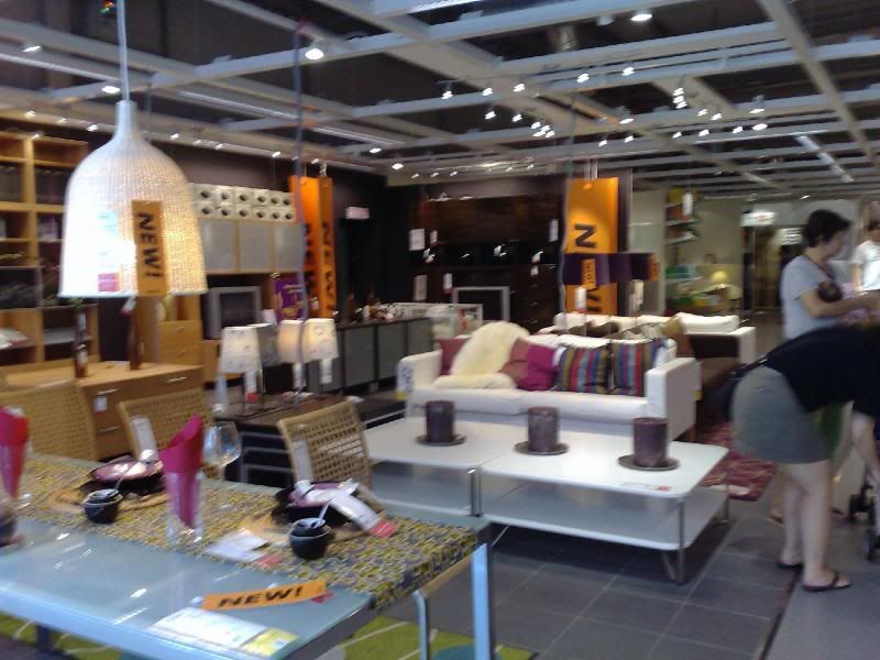 constructed and designed showroom ‘sets’ simulate an idea of a perfect home, and although consumers are aware that they are in a place of consumption and consumerism, the illusion created by IKEA is effective in lulling consumers into a state where they forget that the setting is part of IKEA’s marketing strategy. In this way IKEA can be viewed as a third order simulacrum, presenting an image, which though not a true representation of reality, behaves as if the imaginary and abstract real that has been produced through connotation is the real.
 constructed and designed showroom ‘sets’ simulate an idea of a perfect home, and although consumers are aware that they are in a place of consumption and consumerism, the illusion created by IKEA is effective in lulling consumers into a state where they forget that the setting is part of IKEA’s marketing strategy. In this way IKEA can be viewed as a third order simulacrum, presenting an image, which though not a true representation of reality, behaves as if the imaginary and abstract real that has been produced through connotation is the real.
One way this is achieved is by dedicating about 5900m2 to displaying showrooms that simulate this home setting. The consumer is thus literally surrounded by images of cosiness and warmth, leading the consumer to believe that IKEA is not selling a product or a piece of furniture but a possible life, and the constant repetition of this visual further reinforces the effect.
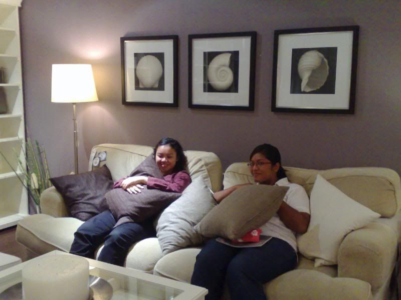
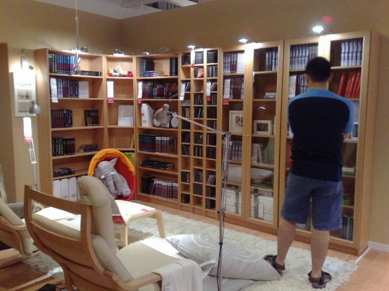
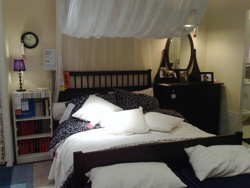
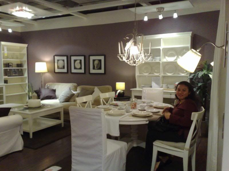
IKEA displays itself not as a shop dedicated to consumerism but as a place where consumers can get ideas for decorating and styling their own, perfect home, masking it’s real purpose behind a façade of warmth and relaxation, presenting an illusion or a simulation of the real, and at the same time, by denying that element of falsity, becomes a third order simulation.
Although it is not immediately evident, IKEA’s environment is one that is highly constructed and carefully planned, with every piece of furniture chosen to create a certain effect. An excellent example is the children’s section at IKEA. Bright colours, cartoon motifs and toys to spark the imagination dominate the design in this part of the store, with occasional toys strewn on the floor to simulate a child’s room.
Although it is not immediately evident, IKEA’s environment is one that is highly constructed and carefully planned, with every piece of furniture chosen to create a certain effect. An excellent example is the children’s section at IKEA. Bright colours, cartoon motifs and toys to spark the imagination dominate the design in this part of the store, with occasional toys strewn on the floor to simulate a child’s room.
In addition to what the consumer sees in IKEA, close attention is also paid to what the consumer does not see: there is a distinct lack of signs that instruct the consumer not to sit or rest on the beds or sofas, further enhancing the illusion of IKEA as a replica of a perfect home. Every detail in the use of space within IKEA thus contributes to the general effect created, and this simulation is so convincing that IKEA thus functions as a third order simulacrum.
The presence of partitions in IKEA is another element that enhances the illusion created in IKEA. IKEA’s use of partitions to enclose the numerous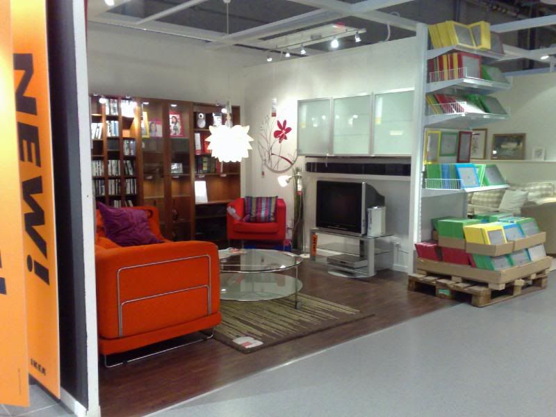 showroom ‘sets’ is a key element that differentiates it from other furniture stores, which typically feature a more open concept, with different areas of a house—such as the living room, bedroom and so on—featured on raised platforms, without any partitions. In this way, the showrooms in IKEA have a sense of privacy that further adds to the sense of being in a real home, adding to the illusion created by IKEA that the store—a very public space dedicated to consumerism—is representative of a home—a very private domain.
 showroom ‘sets’ is a key element that differentiates it from other furniture stores, which typically feature a more open concept, with different areas of a house—such as the living room, bedroom and so on—featured on raised platforms, without any partitions. In this way, the showrooms in IKEA have a sense of privacy that further adds to the sense of being in a real home, adding to the illusion created by IKEA that the store—a very public space dedicated to consumerism—is representative of a home—a very private domain.
Lighting is another aspect of IKEA’s interior that is carefully controlled and manipulated, not merely to enhance the aesthetic appeal of the products, but also to create a comfortable and cosy ambience. The lack of bright spotlights and the use, instead, of ceiling lights and lamps, are all deliberate choices, made for a specific reason: to simulate a home setting.
IKEA not only creates an image of a perfect, ideal home—a simulation—but is so successful in creating that illusion that many consumers do not realise that what they are experiencing in IKEA is an illusion, and it is thus that IKEA is not just a replica of reality, but a replica that denies it’s simulated-ness, and, more importantly, a replica that consumers do not recognise is a replica. In this way, IKEA is, undoubtedly, a third order simulacrum.
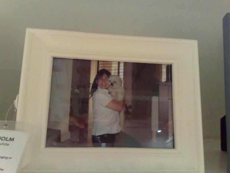
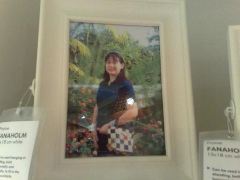
The idyll perfection of the world created within IKEA has no real reference in reality, especially in terms of what is connoted. Subtle ‘human touches’ scattered around the showroom displays imply a happy, ideal lifestyle that IKEA wants the consumer to believe is a possible reality if they buy IKEA furniture, but this reality is in fact, hyperreality.
http://ikeaism.wordpress.com

No comments:
Post a Comment