

http://www.colourlovers.com/palettes/most-loved/all-time/grid


http://colour.pro/
Basic Color Theory
Color theory encompasses a multitude of definitions, concepts and design applications - enough to fill several encyclopedias. However, there are three basic categories of color theory that are logical and useful : The color wheel, color harmony, and the context of how colors are used.
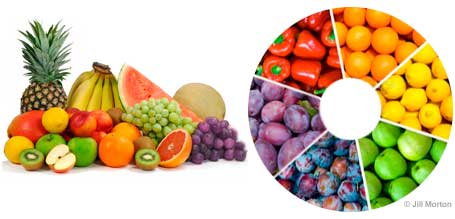
Color theories create a logical structure for color. For example, if we have an assortment of fruits and vegetables, we can organize them by color and place them on a circle that shows the colors in relation to each other.
The Color Wheel
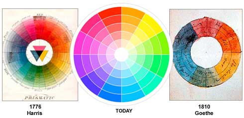
A color circle, based on red, yellow and blue, is traditional in the field of art. Sir Isaac Newton developed the first circular diagram of colors in 1666. Since then, scientists and artists have studied and designed numerous variations of this concept. Differences of opinion about the validity of one format over another continue to provoke debate. In reality, any color circle or color wheel which presents a logically arranged sequence of pure hues has merit.
There are also definitions (or categories) of colors based on the color wheel. We begin with a 3-part color wheel.
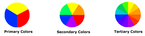
Primary Colors: Red, yellow and blue
In traditional color theory (used in paint and pigments), primary colors are the 3 pigment colors that can not be mixed or formed by any combination of other colors. All other colors are derived from these 3 hues.
In traditional color theory (used in paint and pigments), primary colors are the 3 pigment colors that can not be mixed or formed by any combination of other colors. All other colors are derived from these 3 hues.
Secondary Colors: Green, orange and purple
These are the colors formed by mixing the primary colors.
Tertiary Colors: Yellow-orange, red-orange, red-purple, blue-purple, blue-green & yellow-green
These are the colors formed by mixing a primary and a secondary color. That's why the hue is a two word name, such as blue-green, red-violet, and yellow-orange.
Color Harmony
Harmony can be defined as a pleasing arrangement of parts, whether it be music, poetry, color, or even an ice cream sundae.
In visual experiences, harmony is something that is pleasing to the eye. It engages the viewer and it creates an inner sense of order, a balance in the visual experience. When something is not harmonious, it's either boring or chaotic. At one extreme is a visual experience that is so bland that the viewer is not engaged. The human brain will reject under-stimulating information. At the other extreme is a visual experience that is so overdone, so chaotic that the viewer can't stand to look at it. The human brain rejects what it can not organize, what it can not understand. The visual task requires that we present a logical structure. Color harmony delivers visual interest and a sense of order.
In summary, extreme unity leads to under-stimulation, extreme complexity leads to over-stimulation. Harmony is a dynamic equilibrium.
Some Formulas for Color Harmony
There are many theories for harmony. The following illustrations and descriptions present some basic formulas.
1. A color scheme based on analogous colors

Analogous colors are any three colors which are side by side on a 12 part color wheel, such as yellow-green, yellow, and yellow-orange. Usually one of the three colors predominates.
2. A color scheme based on complementary colors
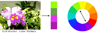
Complementary colors are any two colors which are directly opposite each other, such as red and green and red-purple and yellow-green. In the illustration above, there are several variations of yellow-green in the leaves and several variations of red-purple in the orchid. These opposing colors create maximum contrast and maximum stability.
3. A color scheme based on nature
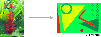
Nature provides a perfect departure point for color harmony. In the illustration above, red yellow and green create a harmonious design, regardless of whether this combination fits into a technical formula for color harmony.
Color Context
How color behaves in relation to other colors and shapes is a complex area of color theory. Compare the contrast effects of different color backgrounds for the same red square.

Red appears more brilliant against a black background and somewhat duller against the white background. In contrast with orange, the red appears lifeless; in contrast with blue-green, it exhibits brilliance. Notice that the red square appears larger on black than on other background colors.
Different readings of the same color

If your computer has sufficient color stability and gamma correction (link to Is Your Computer Color Blind?) you will see that the small purple rectangle on the left appears to have a red-purple tinge when compared to the small purple rectangle on the right. They are both the same color as seen in the illustration below. This demonstrates how three colors can be perceived as four colors.
Observing the effects colors have on each other is the starting point for understanding the relativity of color. The relationship of values, saturations and the warmth or coolness of respective hues can cause noticeable differences in our perception of colour.
Why Color Matters
by Jill Morton
Substantial research shows why color matters and how color plays a pivotal role in all our visual experiences.
Substantial research shows why color matters and how color plays a pivotal role in all our visual experiences.
Color and Marketing
1. Research conducted by the secretariat of the Seoul International Color Expo 2004 documented the following relationships between color and marketing:
92.6 percent said that they put most importance on visual factors when purchasing products. Only 5.6 percent said that the physical feel via the sense of touch was most important. Hearing and smell each drew 0.9 percent.
When asked to approximate the importance of color when buying products, 84.7 percent of the total respondents think that color accounts for more than half among the various factors important for choosing products.
2. Research reveals people make a subconscious judgment about a person, environment, or product within 90 seconds of initial viewing and that between 62% and 90% of that assessment is based on color alone.
Source: CCICOLOR - Institute for Color Research
Source: CCICOLOR - Institute for Color Research
3. Research by the Henley Centre suggests 73% of purchasing decisions are now made in-store. Consequently, catching the shopper's eye and conveying information effectively are critical to successful sales.
Color and Brand Identity
1. Color increases brand recognition by up to 80 percent
Source: University of Loyola, Maryland study
Source: University of Loyola, Maryland study
2. Case Study: Heinz
Consider the phenomenal success Heinz EZ Squirt Blastin' Green ketchup has had in the marketplace. More than 10 million bottles were sold in the first seven months following its introduction, with Heinz factories working 24 hours a day, seven days a week to keep up with demand. The result: $23 million in sales attributable to Heinz green ketchup [the highest sales increase in the brand's history]. All because of a simple color change.
3. Case Study: Apple Computer
Apple brought color into a marketplace where color had not been seen before. By introducing the colorful iMacs, Apple was the first to say, "It doesn't have to be beige". The iMacs reinvigorated a brand that had suffered $1.8 billion of losses in two years. (And now we have the colorful iPods.)
Color Increases Memory
If a picture is worth a thousand words, a picture with natural colors may be worth a million, memory-wise. Psychologists have documented that "living color" does more than appeal to the senses. It also boosts memory for scenes in the natural world.
By hanging an extra "tag" of data on visual scenes, color helps us to process and store images more efficiently than colorless (black and white) scenes, and as a result to remember them better, too.
Source: The findings were reported in the May 2002 issue of the Journal of Experimental Psychology: Learning, Memory and Cognition, published by the American Psychological Association (APA)
"The Contributions of Color to Recognition Memory for Natural Scenes," Felix A. Wichmann, Max-Planck Institut für Biologische Kybernetik and Oxford University; Lindsay T. Sharpe, Universität Tübingen and University of Newcastle; and Karl R. Gegenfurtner, Max-Plank Institut für Biologische Kybernetik and Justus-Liebig-Universität Giessen; Journal of Experimental Psychology – Learning, Memory and Cognition, Vol 28. No.3., 5-May-2002
Color Engages and Increases Participation
Ads in color are read up to 42% more often than the same ads in black and white (as shown in study on phone directory ads).
Source: White, Jan V., Color for Impact, Strathmoor Press, April, 1997
Source: White, Jan V., Color for Impact, Strathmoor Press, April, 1997
Color Informs
Color can improve readership by 40 percent 1, learning from 55 to 78 percent 2, and comprehension by 73 percent 3.
(1)"Business Papers in Color. Just a Shade Better", Modern Office Technology, July 1989, Vol. 34, No. 7, pp. 98-102
(2) Embry, David, "The Persuasive Properties of Color", Marketing Communications, October 1984.
(3) Johnson, Virginia, "The Power of Color", Successful Meetings, June 1992, Vol 41, No. 7, pp. 87, 90.
Color Attracts Attention
Frequently Cited "Facts"
Tests indicate that a black and white image may sustain interest for less than two-thirds a second, whereas a colored image may hold the attention for two seconds or more. (A product has one-twentieth of a second to halt the customer's attention on a shelf or display.)
People cannot process every object within view at one time. Therefore, color can be used as a tool to emphasize or de-emphasize areas.
A Midwestern insurance company used color to highlight key information on their invoices. As a result, they began receiving customer payments an average of 14 days earlier.
Other Research
92% Believe color presents an image of impressive quality
90% Feel color can assist in attracting new customers
90% Believe customers remember presentations and documents better when color is used
83% Believe color makes them appear more successful
81% Think color gives them a competitive edge
76% Believe that the use of color makes their business appear larger to clients
Source: Conducted by Xerox Corporation and International Communications Research from February 19, 2003 to March 7, 2003, margin of error of +/- 3.1%.
Color and the Senses
General facts about sensory input and human beings:
Although the olfactory sense was a human being’s most important source of input in the pre-historic era, sight became our most important means of survival. Furthermore, as hunters and gatherers in the early days of our evolution, we experienced a variety of colors and forms in the landscape. This has become part of our genetic code.
In our current state of evolution, vision is the primary source for all our experiences. (Current marketing research has reported that approximately 80% of what we assimilate through the senses, is visual.)
In our current state of evolution, vision is the primary source for all our experiences. (Current marketing research has reported that approximately 80% of what we assimilate through the senses, is visual.)
Our nervous system requires input and stimulation. (Consider the effects of solitary confinement in jails.) With respect to visual input, we become bored in the absence of a variety of colors and shapes. Consequently, color addresses one of our basic neurological needs for stimulation.
http://www.colormatters.com/color-and-design/
No comments:
Post a Comment