I used phrases and atheistic of Barber Kruger work throughout my lookbook turning all her phrases into consumerism related captions to products..
I used this image of the model showing the sunglasses as her face was tilted to the side and she has a similar expression to that of Krugers statue.
This phrase I captioned a bag with as accessories such as bags are seen as outfit statement pieces that people 'fall' in love with and spend a lot of money on.
Again this is in the accessory section as they are supposed to decorate the body and outift.
This one I saw the connection between a piece of pop art of Litchenstein which was another key aspect to the design atheistic and therefore overlaid the caption on different imagery.
This I thought could be used in connection with the fact that Japan is coming over to Britain.
I twisted the phrase to the sock range exaggerating on a small detail.
Again this is a phrase commonly used with the purchasing of products and therefore I attached it to a large bag as they are normally extravagant prices.
I warped this pop art image so her face was less worried and sad, more of a mixed expression where she appears sad but when you read the caption you realise that it's actually a happy crying and an extreme emotion towards shoes.
I realised that this pop art image of the ring was good for the accessory section and sold the ideal of marriage and love like adverts do with models looks and perfect situations/moments. I then made the connection of how it was like Michael Angelo's 'Creation of Adam'. After researching it to find out what the purpose of the painting was I tried to find an appropriate phrase which would make the connection between the creation of man made in the image and likeness of god and the accessory range.
Japanese translation:
I used key quotes I sourced for my essay in specific places in the publication so they related to the imagery.
This is the fold out page of the lookbook. I chose to do a fold out page of the hats as they are all exactly the same but different colours. The way the page folds out shows the repetition and reproduction of the same mass produced goods.
Using part of Kruger's Selfridges campaign I put this phrase on the reverse of the fold out in the pop art style I had used for the imagery so it's almost subliminal like the manipulation in consumer culture and advertising.

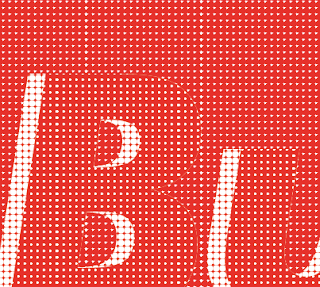
Close up of the dots:
What didn't work:
I tried putting the Japanese text in a box like Kruger's phrases but it didn't look as good as I had hoped.
I also thought that the red was in stark contrast to some of the other pages on the spread so I tried creating it in the same colour scheme but it wasn't very clear at all especially in comparison to the red.


No comments:
Post a Comment